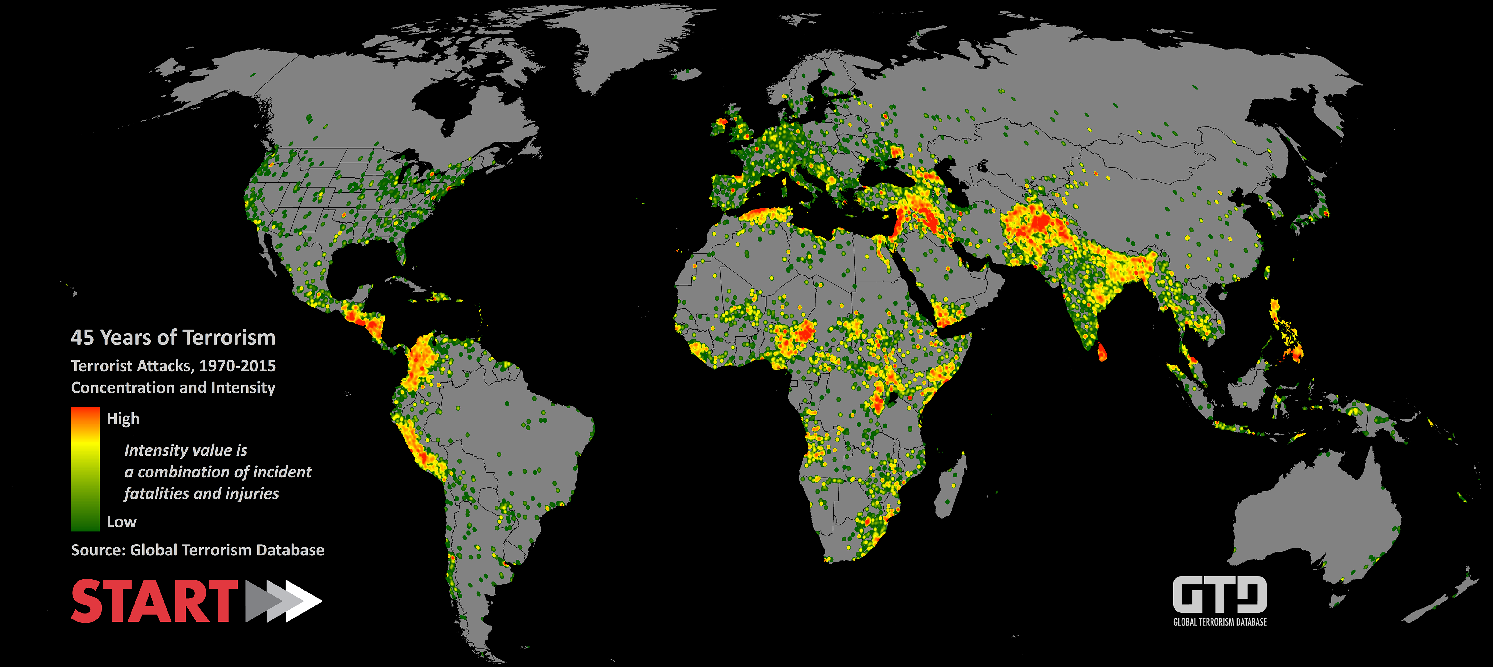

Global Terrorism Database (1970 - 2015) Descriptive Data Visualization
This post is the second of my three posts on the explorative data analysis project on Global Terrorism Database (GTD). For more information regarding the details of GTD or the project in general, please check out my previous post Global Terrorism Database (1970 - 2015) Preliminary Data Cleaning.
All relevant codes used to generate visuals in these three posts can be found at my GitHub GTD repository.
Understand Terror Attacks in the U.S.
Now that I have cleaned and preprocessed the data frame for the analysis, I will get my feet wet with a glimpse of the trend of attacks in the U.S.. I start by looking at the terror attacks across time and geolocations.
Question 1: How Have The Attacks In the U.S. Changed over Time?
To answer this question, I can check out how many incidents happened in the U.S. for each year, ever since 1970:
g1 <-  dt %>% dplyr::group_by(iyear) %>%
  summarise(n_incident = n()) %>%
  ggplot(aes(iyear, n_incident)) + geom_line() + xlab("") + ylab("Attack Count") + theme_light() +
  ggtitle("Count of U.S. Terror Attacks Over Years")
g1
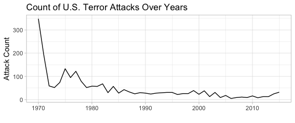
Above chart indicates that the number of terror attacks in the U.S. is decreasing since 1970; however, this might contradict with people’s recent memory since “9.11” was one of the biggest terror attacks on U.S. history. Therefore, we should instead use measurements that reflect the impact of the attacks, such as number of victims killed (nkill) or injured (nwound), to understand the scopes of the attacks.
# Compare the attacks, kills, and wounds over years
g2 <-  dt %>% dplyr::group_by(iyear) %>% summarise(killed = sum(nkill, na.rm=TRUE), injured = sum(nwound, na.rm=TRUE), count = n()) %>%
  melt(id.vars="iyear", measure.vars=c('killed','injured','count')) %>%
  ggplot(aes(iyear, value, group = variable, color=variable)) +
  geom_line() + xlab("") + ylab("Count") + theme_light() + ggtitle("U.S. Terror Attack Impact Over Years")
g2
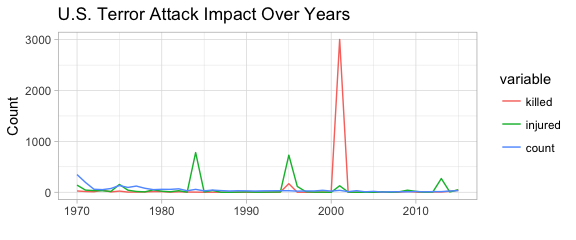
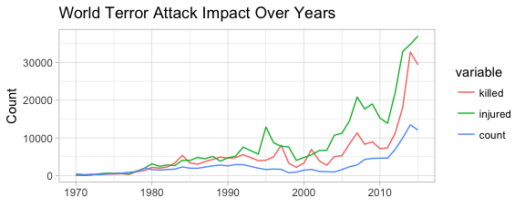
With the killed and injured considered, I now draw a better picture of the scope of the terror attacks in the U.S.. Apparently the biggest terror attack ever since 1970 in no doubt happened in 2001, i.e. the “9.11” attack. We are also seeing three spikes in number of injured victims (injured) in 1984, 1995, and 2013. To get a better understanding of what these attacks are, we can rank the terror attacks in terms of the impact and check out their details:
t1 <- (dt %>% mutate(nkill = ifelse(is.na(nkill), 0, nkill),
                     nwound = ifelse(is.na(nwound), 0, nwound),
                     n_killwound = nkill + nwound) %>% arrange(desc(n_killwound)) %>%
         dplyr::select(nkill, nwound, idate, provstate, gname, summary))
| Date | State | Killed | Injured | Terror Group |
|---|---|---|---|---|
| 2001-09-11 | New York | 1381.5 | 0 | Al-Qaida |
| 2001-09-11 | New York | 1381.5 | 0 | Al-Qaida |
| 1995-04-19 | Oklahoma | 168 | 650 | Unaffiliated Individual(s) |
| 1984-09-21 | Oregon | 0 | 751 | Rajneeshees |
| 2001-09-11 | Virginia | 189 | 106 | Al-Qaida |
| 2013-04-15 | Massachusetts | 2 | 132 | Unaffiliated Individual(s) |
| 2013-04-15 | Massachusetts | 1 | 132 | Unaffiliated Individual(s) |
The above chart corresponds with our analysis from the chart. The biggest attacks in the U.S. includes not only the “9.11” series, but also attacks conducted by Rajneeshees and unaffiliated individuals in 1995, 1984, and 2013.
Question 2: What are the Worldwide Attack Trend Compared to the U.S.?
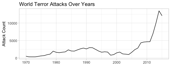
For reference purposes, I also checked the incident occurrence around the world. Interestingly enough, the count of terror attacks around the world are increasing in recent years, and even reached the exponential point after 2000. It seems that the year of 2001 (“9.11”) is not only a landmark for the attacks in the U.S., but also for those around the world. Moreover, it is noted that the terror attacks happening in the U.S. dwarf in front of the worldwide attacks: apparently there are places in the world that needs even more help in coping these attacks.
# Display the attack count of the world over years
g1_w <-  dt_w %>% dplyr::group_by(iyear) %>% summarise(n_incident = n()) %>%
  ggplot(aes(iyear, n_incident)) + geom_line() + xlab("") + ylab("Attack Count") + theme_light() +
  ggtitle("World Terror Attacks Over Years")
g1_w
I also created a graph of killed, injured, and attack count for incidents around the world:
# Compare the attacks and casualties of the world over years
g2_w <-  dt_w %>% dplyr::group_by(iyear) %>% summarise(killed = sum(nkill, na.rm=TRUE), injured = sum(nwound, na.rm=TRUE), count = n()) %>%
  melt(id.vars="iyear", measure.vars=c('killed','injured','count')) %>%
  ggplot(aes(iyear, value, group = variable, color=variable)) + geom_line() + xlab("") + ylab("Count") +
  theme_light() + ggtitle("World Terror Attack Impact Over Years")
g2_w
Contrary to the U.S., terror attacks around the world not only claim more occurrence in recent decades, but also more death and injuries. What are the biggest single attacks around the world then?
# Identify the biggest attacks in the world in terms of casualties
t1_w <- (dt_w %>% mutate(nkill = ifelse(is.na(nkill), 0, nkill),
                     nwound = ifelse(is.na(nwound), 0, nwound),
                     n_killwound = nkill + nwound) %>% arrange(desc(n_killwound)) %>%
         dplyr::select(nkill, nwound, idate, country_txt, gname, summary))
| Date | State | Killed | Injured | Terror Group |
|---|---|---|---|---|
| 1995-03-21 | Japan | 13 | 5500 | Aum Shinri Kyo |
| 1998-08-07 | Kenya | 224 | 4000 | Al-Qaida |
| 2001-09-11 | United States | 1381.5 | 0 | Al-Qaida |
| 2001-09-11 | United States | 1381.5 | 0 | Al-Qaida |
| 1996-01-31 | Sri Lanka | 90 | 1272 | Liberation Tigers of Tamil Eelam (LTTE) |
| 2008-02-02 | Chad | 160 | 1001 | Rebels |
| 2004-09-01 | Russia | 344 | 727 | Riyadus-Salikhin Reconnaissance and Sabotage Battalion of Chechen Martyrs |
| 2006-07-11 | India | 188 | 817 | Lashkar-e-Taiba (LeT) |
| 2007-08-14 | Iraq | 250 | 750 | Al-Qaida in Iraq |
| 2007-08-14 | Iraq | 250 | 750 | Al-Qaida in Iraq |
The above table tells us that the “9.11” attack is still the biggest attacks around the world when it comes to the death of victims in the single attack. Other countries such as Japan, Kenya, Sri Lanka, Chad, Russia, India, and Iraq also suffers huge loss from major terror attacks.
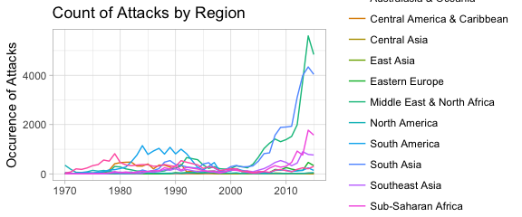
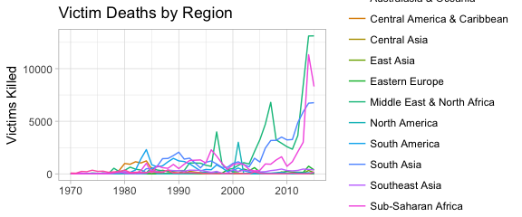
I then created regional breakdown graphs of attack impact as below:
# Look at attacks and casualties over the years by region
g2_w_1 <-  dt_w %>% mutate(region=region_txt) %>% dplyr::group_by(iyear, region) %>%
  summarise(nkill = sum(nkill, na.rm=TRUE), nwound = sum(nwound, na.rm=TRUE), n_incident = n()) %>%
  ggplot(aes(iyear, n_incident, group = region, color=region)) +
  geom_line() + xlab("") + ylab("Occurence of Attacks") + ggtitle("Count of Attacks by Region") +
  theme_light()
g2_w_1
g2_w_2 <-  dt_w %>% mutate(region=region_txt) %>%
  dplyr::group_by(iyear, region) %>%
  summarise(nkill = sum(nkill, na.rm=TRUE), nwound = sum(nwound, na.rm=TRUE), n_incident = n()) %>%
  ggplot(aes(iyear, nkill, group = region, color=region)) +
  geom_line() + xlab("") + ylab("Victims Killed") + ggtitle("Victim Deaths by Region") +
  theme_light()
g2_w_2
g2_w_3 <-  dt_w %>% mutate(region=region_txt) %>%
  dplyr::group_by(iyear, region) %>% summarise(nkill = sum(nkill, na.rm=TRUE), nwound = sum(nwound, na.rm=TRUE), n_incident = n()) %>%
  ggplot(aes(iyear, nwound, group = region, color=region)) +
  geom_line() + xlab("") + ylab("Victims Injured") + ggtitle("Victim Injured by Region") +
  theme_light()
g2_w_3
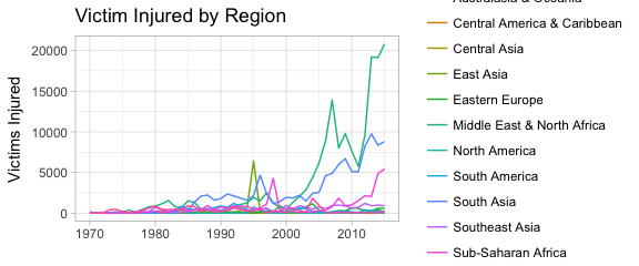
From these graphs we can infer that Middle East & North Africa, South Asia, and Sub-Saharan Africa are the regions most heavily infested by terror attacks in recent years.
Question 3: Are There Any Attack Patterns by Date, Types, and Target?
I then tried to cross-tabulate the attack measurements with date and time, in order to see if I can identify any patterns between attack occurrence / impact and weekday / month.
# Explore the attack freq pattern for day of week and month of year
dt1 <- dt %>% mutate(iweekday = factor(weekdays(dt$idate),
levels = c('Sunday','Monday','Tuesday',
'Wednesday','Thursday','Friday','Saturday')),
imonth = factor(imonth),
nkill = ifelse(is.na(nkill), 0, nkill),
nwound = ifelse(is.na(nwound), 0, nwound),
n_killwound = nkill + nwound) %>%
dplyr::group_by(imonth, iweekday) %>% summarise(n_killwound = sum(n_killwound), n_incident = n())
g3 <- dt1 %>% mutate(iweekday = factor(iweekday, levels=rev(levels(iweekday)))) %>%
ggplot(aes(x=imonth, y=iweekday, fill=n_incident)) +
geom_tile(color="white", size=0.1)+ coord_equal() +
labs(x=NULL, y=NULL, title="Count of Attacks Per Month by Weekday") +
theme(plot.title=element_text(hjust=0.5, size = 10)) + theme(axis.ticks=element_blank()) +
theme(axis.text=element_text(size=7)) + theme(legend.position="none") +
scale_fill_gradient(low = "white", high = "darkviolet")
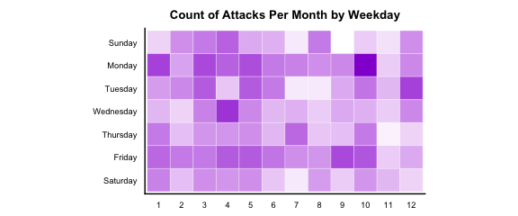
g3
g4 <- dt1 %>% mutate(iweekday = factor(iweekday, levels=rev(levels(iweekday)))) %>%
  ggplot(aes(x=imonth, y=iweekday, fill=n_killwound)) +
  geom_tile(color="white", size=0.1)+ coord_equal() +
  labs(x=NULL, y=NULL, title="Number of Injuries or Wounds Per Month by Weekday") +
  theme(plot.title=element_text(hjust=0.5, size = 10)) + theme(axis.ticks=element_blank()) +
  theme(axis.text=element_text(size=7)) + theme(legend.position="none") +
  scale_fill_gradient(low = "white", high = "darkviolet")
g4
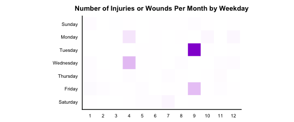
Apparently Mondays and Fridays are weekdays when attacks are likely to happen regardless of which month it is. Weekends seem to have more attacks than the rest of the weekdays. November, August, and February seem to see less attacks than other months. For the wounds and injuries, since the extreme impacts by the biggest attacks are too dramatic comparing to smaller attacks, I can’t see much of a pattern in the heat map.
Interested to see how attacks of different types are distributed over day of the week and month of the year, I created the following graphs for a detailed look.
# Create a dataframe specifically for attacktypes and targettypes
dt2 <- dt %>% mutate(iweekday = factor(weekdays(dt$idate),
                                      levels = c('Sunday','Monday','Tuesday',
                                                 'Wednesday','Thursday','Friday','Saturday')),
                    imonth = factor(imonth)) %>%
  dplyr::select(eventid, iyear, iweekday, imonth, targtype1_txt, targtype2_txt, targtype3_txt, attacktype1_txt, attacktype2_txt, attacktype3_txt) %>%
  melt(id.vars =c('eventid','iyear','iweekday','imonth', 'attacktype1_txt', 'attacktype2_txt',
                  'attacktype3_txt'),
       measure.vars = c('targtype1_txt','targtype2_txt', 'targtype3_txt'),
       na.rm = TRUE, value.name = "targtype_txt") %>%
  dplyr::select(-variable) %>%
  melt(id.vars = c('eventid','iyear','iweekday','imonth','targtype_txt'),
       measure.vars = c('attacktype1_txt', 'attacktype2_txt','attacktype3_txt'),
       na.rm = TRUE, value.name = "attacktype_txt") %>%
  dplyr::select(-variable) %>% mutate(targtype_txt = factor(targtype_txt),
                                      attacktype_txt = factor(attacktype_txt),
                                      idecades = factor(ifelse(iyear >= 2010, "Since 2010",
                                             ifelse(iyear >= 2000,  "2000s",
                                                    ifelse(iyear >= 1990, "1990s",
                                                           ifelse(iyear >= 1980, "1980s", "1970s"))))))
# Create a heatmap with weekday by attack type
g5 <- dt2 %>% dplyr::group_by(iweekday, attacktype_txt) %>% summarise(n_incident=n()) %>%
ggplot(aes(y=reorder(attacktype_txt, n_incident), x=factor(iweekday, levels=rev(levels(iweekday))),
fill=n_incident)) +
geom_tile(color="white", size=0.1)+ coord_equal() +
labs(x=NULL, y=NULL, title="Count of Attacks: Attack Type by Weekday") +
theme(plot.title=element_text(hjust=0.5, size = 10)) + theme(axis.ticks=element_blank()) +
theme(axis.text=element_text(size=7)) + theme(legend.position="none") +
scale_fill_gradient(low = "lavenderblush", high = "darkviolet") +
theme(axis.text.x = element_text(angle = 90))
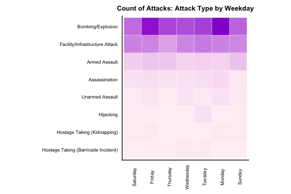
g5
# Create a heatmap of attack type by era
g6 <- dt2 %>% dplyr::group_by(idecades, attacktype_txt) %>% summarise(n_incident=n()) %>%
  ggplot(aes(y=reorder(attacktype_txt, n_incident), x=idecades, fill=n_incident)) +
  geom_tile(color="white", size=0.1)+ coord_equal() +
  labs(x=NULL, y=NULL, title="Count of Attacks: Attack Type by Era") +
  theme(plot.title=element_text(hjust=0.5, size = 10)) + theme(axis.ticks=element_blank()) +
  theme(axis.text=element_text(size=7)) + theme(legend.position="none") +
  scale_fill_gradient(low = "lavenderblush", high = "darkviolet")
g6
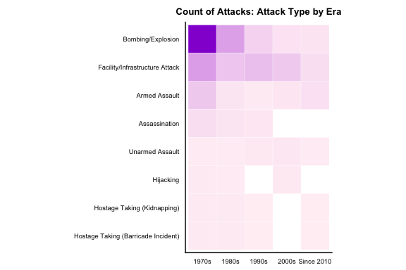
From these graphs I can infer that the most common attack types in the U.S. are Bombing/Explosion, Facility/Infrastructure Attack, and Armed Assault. Monday and Friday, again, seems to be the heavily condensed time slot for the attacks, especially for Bombing/Explosion attacks. In terms of the decades, Bombing/Explosion was a dominating attack type back in the 1970s and 1980s.
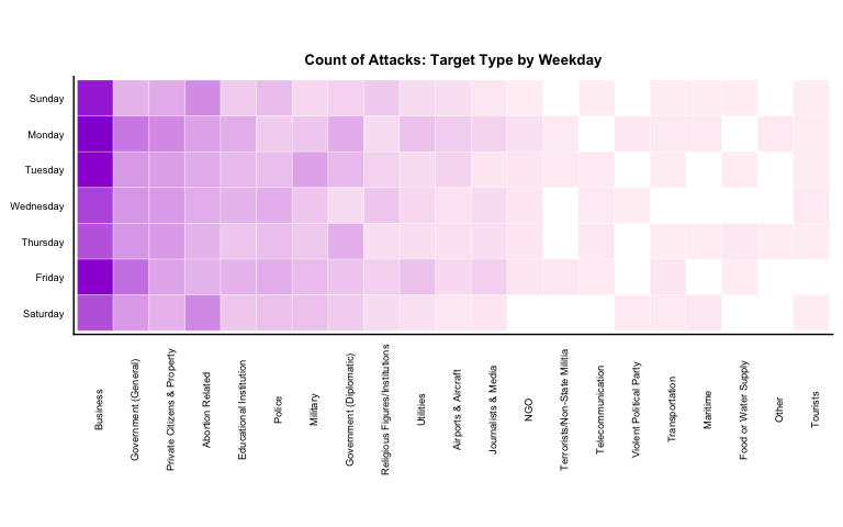
I then created several graphs by attack target type and weekdays to explore the relations between target type and time.
# Create a heatmap with weekday by target type
g7 <- dt2 %>% dplyr::group_by(iweekday, targtype_txt) %>% summarise(n_incident=n()) %>%
  ggplot(aes(x=reorder(targtype_txt, -n_incident), y=factor(iweekday, levels=rev(levels(iweekday))),
             fill=n_incident)) +
  geom_tile(color="white", size=0.1)+ coord_equal() +
  labs(x=NULL, y=NULL, title="Count of Attacks: Target Type by Weekday") +
  theme(plot.title=element_text(hjust=0.5, size = 10)) + theme(axis.ticks=element_blank()) +
  theme(axis.text=element_text(size=7)) + theme(legend.position="none") +
  scale_fill_gradient(low = "lavenderblush", high = "darkviolet") +
  theme(axis.text.x = element_text(angle = 90))
g7
# Create a heatmap of target type by era
g8 <- dt2 %>% dplyr::group_by(idecades, targtype_txt) %>% summarise(n_incident=n()) %>%
  ggplot(aes(x=reorder(targtype_txt, -n_incident), y=idecades, fill=n_incident)) +
  geom_tile(color="white", size=0.1)+ coord_equal() +
  labs(x=NULL, y=NULL, title="Count of Attacks: Target Type by Era") +
  theme(plot.title=element_text(hjust=0.5, size = 10)) + theme(axis.ticks=element_blank()) +
  theme(axis.text=element_text(size=7)) + theme(legend.position="none") +
  scale_fill_gradient(low = "lavenderblush", high = "darkviolet") +
  theme(axis.text.x = element_text(angle = 90))
g8
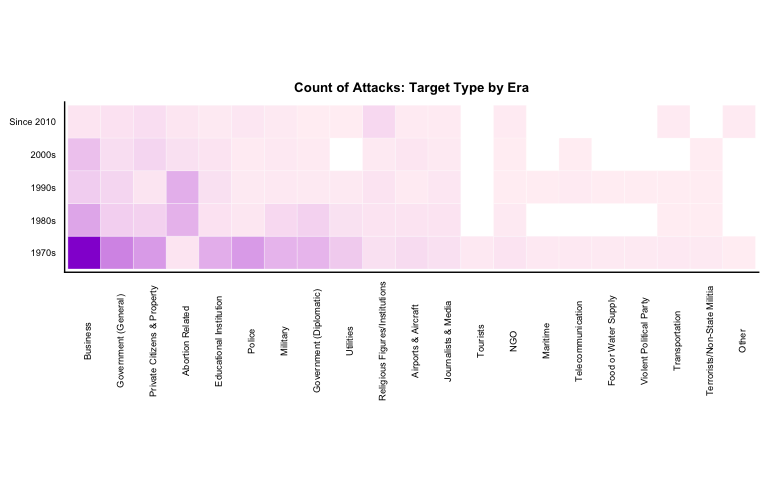
From the above graphs, I can infer that the most common targets for terror attacks are Business, Government(General), and Private Citizens & Property. It is astonishing to see that “Abortion Related” targets are the top fourth common targets for the attacks. The above graphs also indicate that targets types are more spread-out than the attack type for terror attacks in the U.S..
When exploring the attack count by decades, it’s apparent that attacks on Business are less frequent since 2000s, while the attacks on Abortion Related targets are relatively more frequent in the 1980s and 1990s.
I did not observe too much of a pattern over weekdays or months, so I changed focus and created a heat map by attack types and target types, as below:
# Create a heatmap of targettype by attack type
g9 <- dt2 %>% dplyr::group_by(attacktype_txt, targtype_txt) %>% summarise(n_incident=n()) %>%
  ggplot(aes(x=reorder(targtype_txt, -n_incident),
             y=reorder(attacktype_txt, -n_incident), fill=n_incident)) +
  geom_tile(color="white", size=0.1)+ coord_equal() +
  labs(x=NULL, y=NULL, title="Count of Attacks: Target Type by Attack Type") +
  theme(plot.title=element_text(hjust=0.5, size = 10)) + theme(axis.ticks=element_blank()) +
  theme(axis.text=element_text(size=7)) + theme(legend.position="none") +
  scale_fill_gradient(low = "lavenderblush", high = "darkviolet") +
  theme(axis.text.x = element_text(angle = 90))
g9
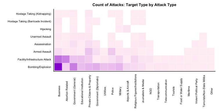
The chart above does not bring in much additional knowledge. Unsurprisingly, the most frequent attack types (Bombing/Explosion, Facility/Infrastructure Attack) corresponds with the most frequent target types (Business, Abortion Related, Government(General)).
In my next post, I will take a further step and examine the characteristics of attacks in the U.S. in greater detail to:
- Focus more on recent attack features
- Examine the geospacial locations of the attacks


Leave a Comment