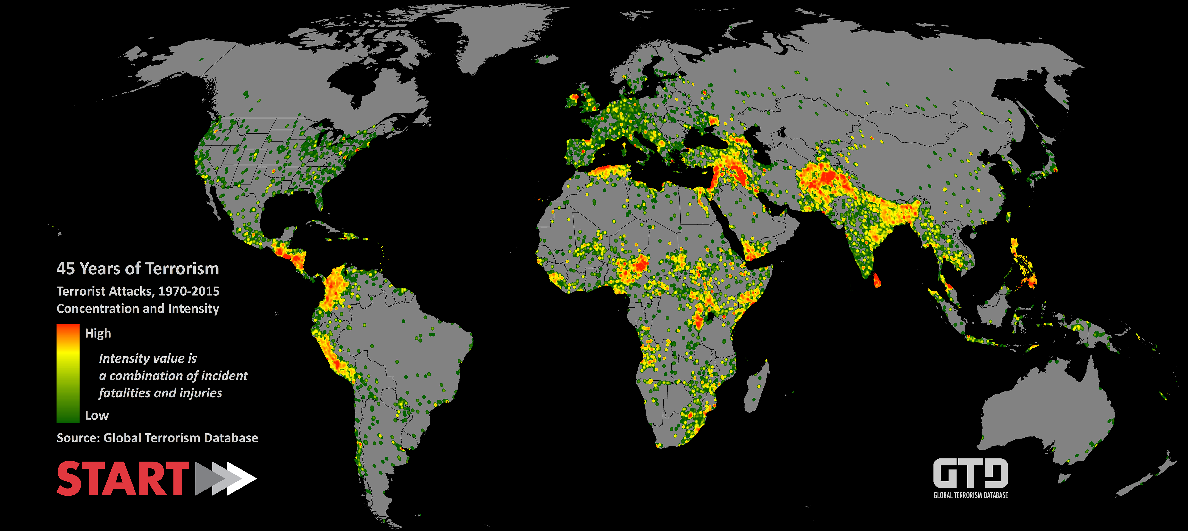

Global Terrorism Database (1970 - 2015) Detailed Analytics
This post is the third of my three posts about the explorative data analysis project on Global Terrorism Database (GTD). All of the research questions were raised by me based on my background knowledge in international affairs. For more information regarding the details of GTD or the project in general, please check out my previous post Global Terrorism Database (1970 - 2015) Preliminary Data Cleaning.
All relevant codes used to generate visuals in these three posts can be found at my GitHub GTD repository.
Note: some visuals created in this post does have an interactive HTML widget version. If you click on those graphs, you will see the interactive version in a new tab in your browser.
Digging into Attack Patterns
Question 1: How Have the Major Attack Type and Target Type Changed over Years?
With a rough understanding of the concentration of attacks in attack type and target type, it is worthwhile to see if these trends changed over the years. I regrouped the attacks by the most frequent categories and developed several time-based visualizations.
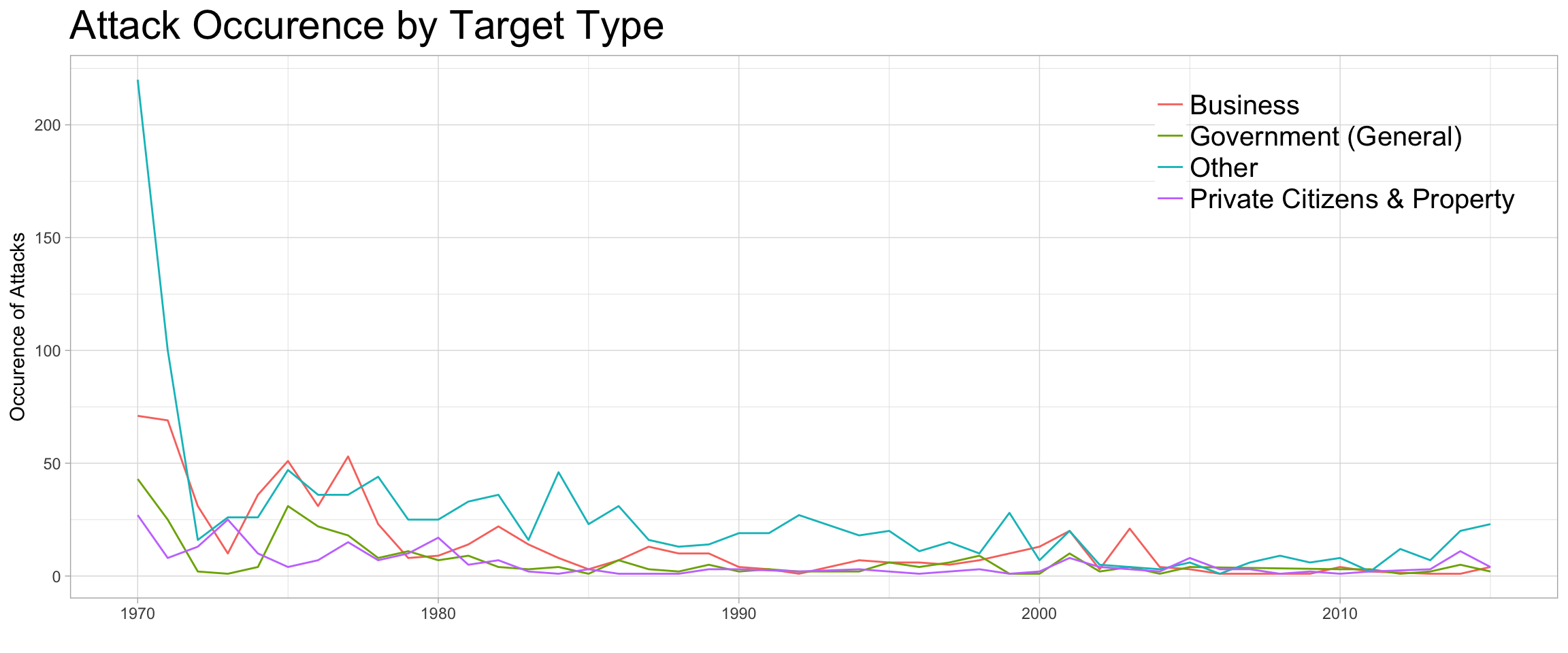
For the terror attack type graph, I regrouped the attacks into Bombing/Explosion, Facility/Infrastructure Attack and Other and display attack count over the years.
dt3 <- dt %>%
  dplyr::select(eventid, iyear, targtype1_txt, targtype2_txt,
                targtype3_txt, attacktype1_txt, attacktype2_txt, attacktype3_txt) %>%
  melt(id.vars =c('eventid','iyear', 'attacktype1_txt', 'attacktype2_txt','attacktype3_txt'),
       measure.vars = c('targtype1_txt','targtype2_txt', 'targtype3_txt'),
       na.rm = TRUE, value.name = "targtype_txt") %>%
  dplyr::select(-variable) %>%
  melt(id.vars = c('eventid','iyear','targtype_txt'),
       measure.vars = c('attacktype1_txt', 'attacktype2_txt','attacktype3_txt'),
       na.rm = TRUE, value.name = "attacktype_txt") %>%
  dplyr::select(-variable) %>%
  mutate(targtype_txt = factor(
    ifelse(targtype_txt=="Business","Business",
           ifelse(targtype_txt=="Government (General)","Government (General)",
                  ifelse(targtype_txt=="Private Citizens & Property", "Private Citizens & Property","Other")))),
    attacktype_txt = factor(
      ifelse(attacktype_txt=="Bombing/Explosion", "Bombing/Explosion",
             ifelse(attacktype_txt=="Facility/Infrastructure Attack", "Facility/Infrastructure Attack",
                    "Other"))))

g10 <- dt3 %>% mutate(attack_type = attacktype_txt) %>% dplyr::group_by(iyear, attack_type) %>% summarise(n_incident = n()) %>%
  ggplot(aes(x=iyear, y = n_incident, group = attack_type, color = attack_type)) + geom_line()+
  xlab("") + ylab("Occurence of Attacks") + ggtitle("Attack Occurence by Attack Type") +
  theme_light() + theme(legend.position = c(0.85, 0.83),
                        legend.title = element_blank(),
                        legend.text = element_text(size = 15),
                        legend.background = element_blank(),
                        plot.title = element_text(size=22))
g10
Note: Interactive Visual Available for this graph, click on the graph to view.

The above graph indicates that Bombing/Explosion was a dominating type back in the 1970s and 1980s, while Facility/Infrastructure Attack picked up in the 1990s and early 2000s. In the most recent decade, however, attacks are taking other forms (as Other type). I will revisit this “Other” type in following analysis.
I then regrouped target type into Business, Government(General), Private Citizens & Property and Other and plotted the following graph for the attack count by target type.
# Look at the attack by target type over the years
g11 <- dt3 %>% mutate(target_type = targtype_txt) %>% dplyr::group_by(iyear, target_type) %>% summarise(n_incident = n()) %>%
  ggplot(aes(x=iyear, y = n_incident, group = target_type, color = target_type)) + geom_line()+
  xlab("") + ylab("Occurence of Attacks") + ggtitle("Attack Occurence by Target Type") +
  theme_light() + theme(legend.position = c(0.85, 0.83),
                        legend.title = element_blank(),
                        legend.text = element_text(size = 15),
                        legend.background = element_blank(),
                        plot.title = element_text(size=22))
g11
Note: Interactive Visual Available for this graph, click on the graph to view.
From the above graph I can infer that Business has consistently been the target of terror attacks over the years, while Other targets take a large portion in the distribution. I will revisit this “Other” group in later analysis.
After plotting the count by attack types and target types in above graphs, it is clear that these most frequent types claimed more attacks back in the 1970s to 1990s. Other attack types and target types became more crucial after the 2000s, indicating that the attack type and target type pattern did change over the years.
To better understand terror attacks that happened in more recent years, I narrowed down the time span to years after 2000 and compared the U.S. attacks with those in the World.
# Generate a dataframe for time by type
dt4 <- dt %>%
  dplyr::select(eventid, iyear, targtype1_txt, targtype2_txt,
                targtype3_txt, attacktype1_txt, attacktype2_txt, attacktype3_txt) %>%
  melt(id.vars =c('eventid','iyear', 'attacktype1_txt', 'attacktype2_txt','attacktype3_txt'),
       measure.vars = c('targtype1_txt','targtype2_txt', 'targtype3_txt'),
       na.rm = TRUE, value.name = "targtype_txt") %>%
  dplyr::select(-variable) %>%
  melt(id.vars = c('eventid','iyear','targtype_txt'),
       measure.vars = c('attacktype1_txt', 'attacktype2_txt','attacktype3_txt'),
       na.rm = TRUE, value.name = "attacktype_txt") %>%
  dplyr::select(-variable) %>% mutate(targtype_txt = factor(targtype_txt),
                                      attacktype_txt = factor(attacktype_txt)) %>%
  filter(iyear >= 2000)
# Explore the frequent attacktype in recent years
g12 <- dt4 %>% dplyr::group_by(iyear, attacktype_txt) %>% summarise(n_incident = n()) %>%
  ggplot(aes(x=iyear, y = n_incident, group = attacktype_txt, color = attacktype_txt)) + geom_line()+
  xlab("") + ylab("Occurence of Attacks") + ggtitle("Attack Occurence by Attack Type (Since 2000)") +
  theme_light() + theme(legend.position = c(0.82, 0.80),
                        legend.title = element_blank(),
                        legend.text = element_text(size = 15),
                        legend.background = element_blank(),
                        plot.title = element_text(size=22))
g12
Note: Interactive Visual Available for this graph, click on the graph to view.
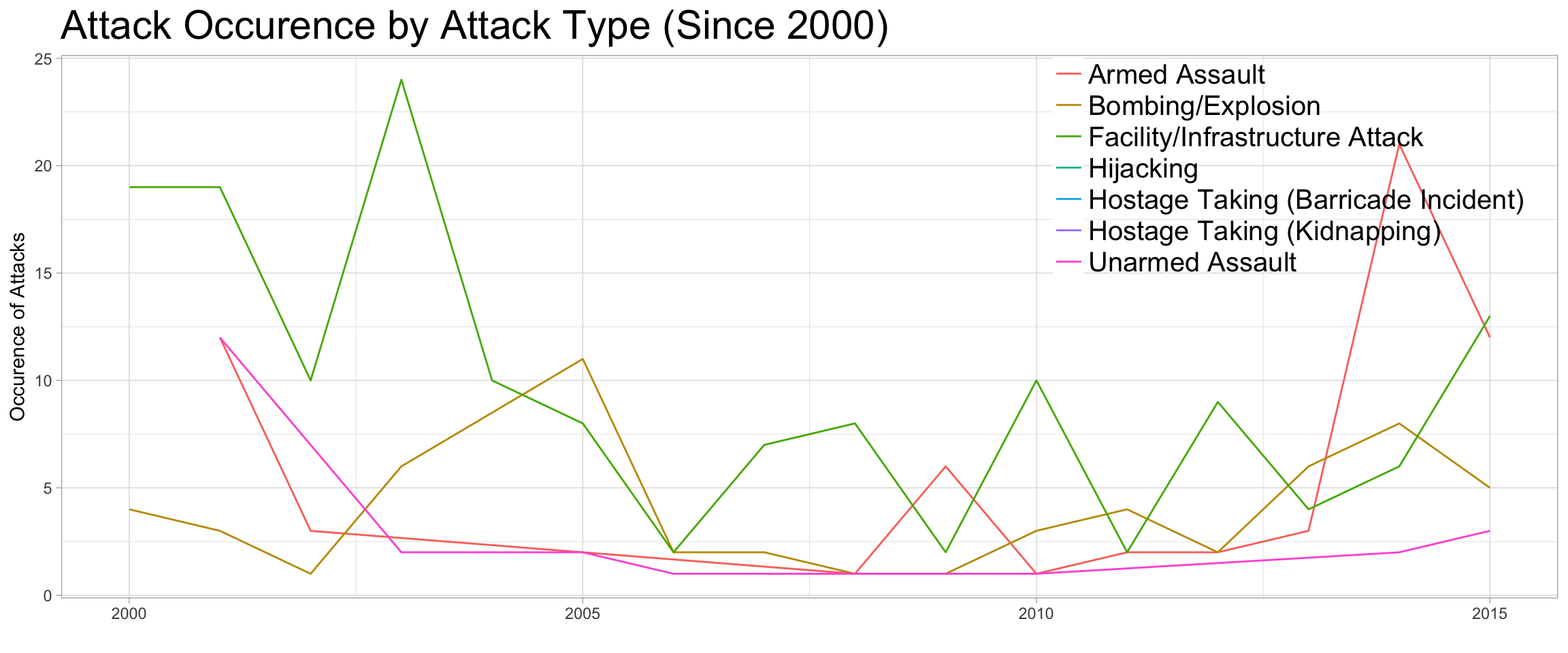
The recent five years have seen the rise of Armed Assault as a major attack type, together with Facility/Infrastructure Attack and Unarmed Assault. Bombing/Explosion is happening less often than before. This reductions in traditionally “typical” attack types seems to related to the fact that the U.S. government might have paid extra attention to the “typical” terror attacks and the terrorists had to seek other approaches in their attacks.
# Explore the most frequent target type in recent years
g13 <- dt4 %>% dplyr::group_by(iyear, targtype_txt) %>% summarise(n_incident = n()) %>%
  ggplot(aes(x=iyear, y = n_incident, group = targtype_txt, color = targtype_txt)) + geom_line()+
  xlab("") + ylab("Occurence of Attacks") + ggtitle("Attack Occurence by Target Type (Since 2000)") +
  theme_light() + theme(legend.title = element_blank(),
                        legend.text = element_text(size = 15),
                        legend.background = element_blank(),
                        plot.title = element_text(size=22))
g13
Note: Interactive Visual Available for this graph, click on the graph to view.
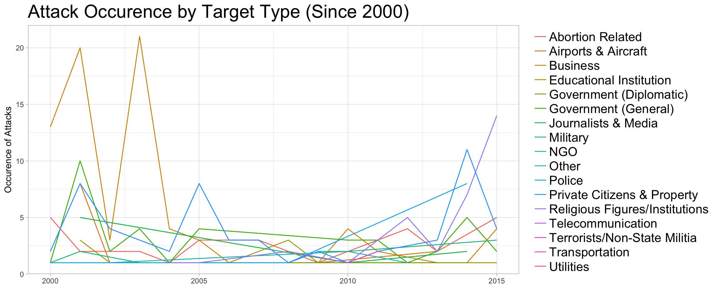
Similar to the attack types, recent years have seen the increase of terror attacks on the Religious Figures/Institutions, Police, and Abortion Related targets. Traditionally “popular” targets, such as Business, was attacked less often, while Private Citizens & Property remains to be a frequent target. The reason behind this, again, might be related to the public safety measurements placed by the government on the “typical” targets, leading to bigger variety in the target type in recent years.
Question 2: Did Attacks with Foreign Connections Happen in Different Locations?
I answered this question by first quickly looking at the coordinates of the incidents, tagged with whether they have any form of foreign connections. The first thing I did is to create a new dataframe from the dataset.
# Generate geolocation-friendly dataframe for the analysis
dt5 <- dt %>% mutate(iweekday = factor(weekdays(dt$idate),
                                      levels = c('Sunday','Monday','Tuesday',
                                                 'Wednesday','Thursday','Friday','Saturday')),
                    imonth = factor(imonth),
                    nkill = ifelse(is.na(nkill), 0, nkill),
                    nwound = ifelse(is.na(nwound), 0, nwound),
                    n_killwound = nkill + nwound,
                    INT_ANY = factor(ifelse(is.na(INT_ANY), "Not Sure",
                                     ifelse(INT_ANY==0, "No Foreign Connections","Has Foreign Connections" ))),
                    idecades = factor(ifelse(iyear >= 2000, "Since 2000",
                                             ifelse(iyear >= 1990,  "1990s","1970~1980s"))))
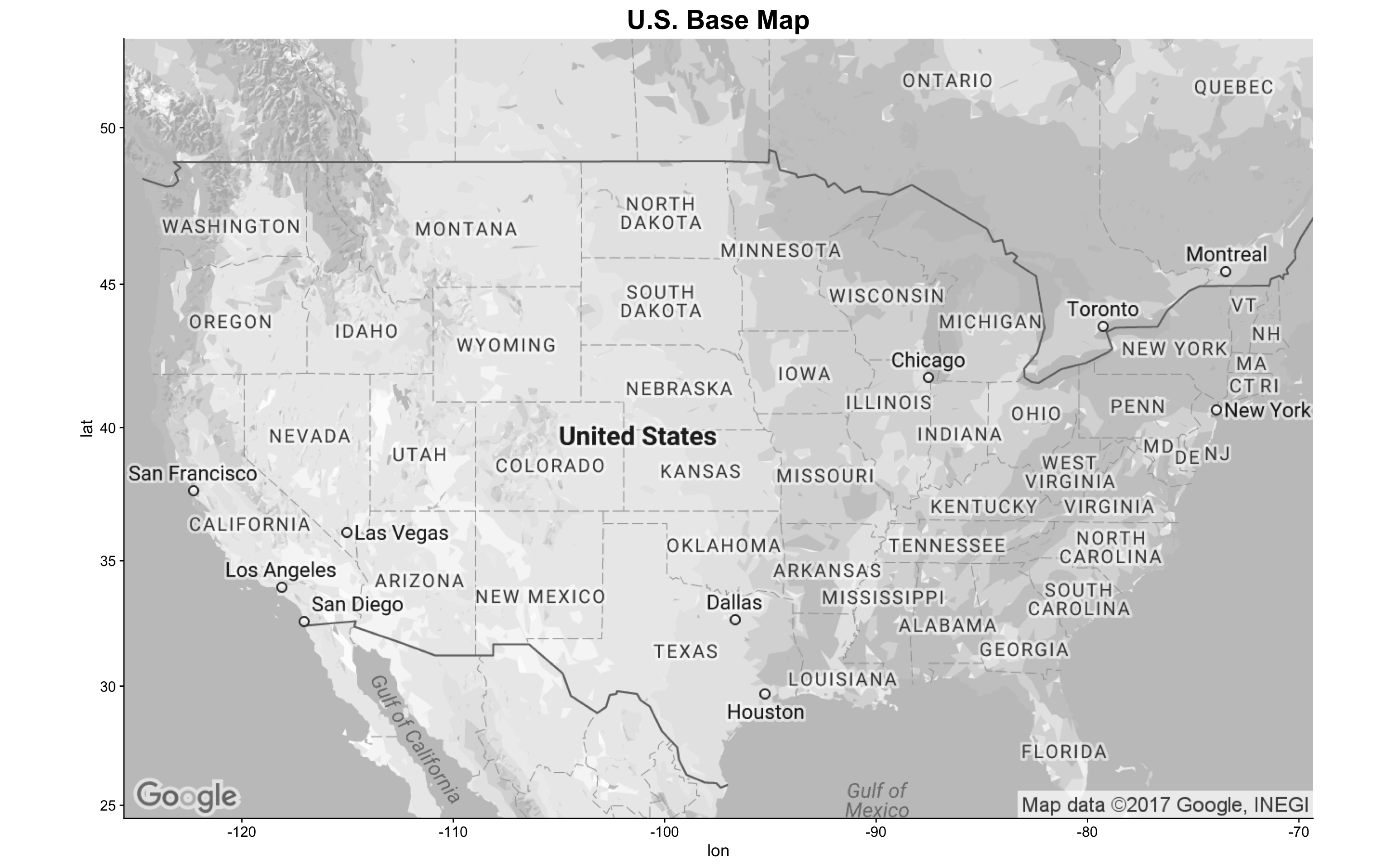
I then downloaded an map directly from Google as the “canvas” for my geospatial analytics.
basemap <- get_googlemap(center = c(lon = -97.5, lat = 40),
                         zoom = 4,
                         size = c(640, 420),
                         maptype = 'roadmap',
                         color = 'bw') %>% ggmap()
basemap + ggtitle("U.S. Base Map") + theme(plot.title = element_text(size=22))
Now that I had the map canvas ready, it’s time to overlay data from my dataframe onto the map.
g14 <- basemap + geom_point(aes(x = longitude, y = latitude,
                                color = INT_ANY),
                            data = dt5,
                            alpha = .5,
                            size = 2.5) +
  ggtitle("Attack by Foreign Connections") +
  scale_colour_manual(values = brewer.pal(3, "Accent")) +
  theme(legend.position = c(0.78, 0.93),
        legend.title = element_blank(),
        legend.text = element_text(size = 15),
        legend.background = element_rect(fill = 'white'),
        plot.title = element_text(size=22))
g14
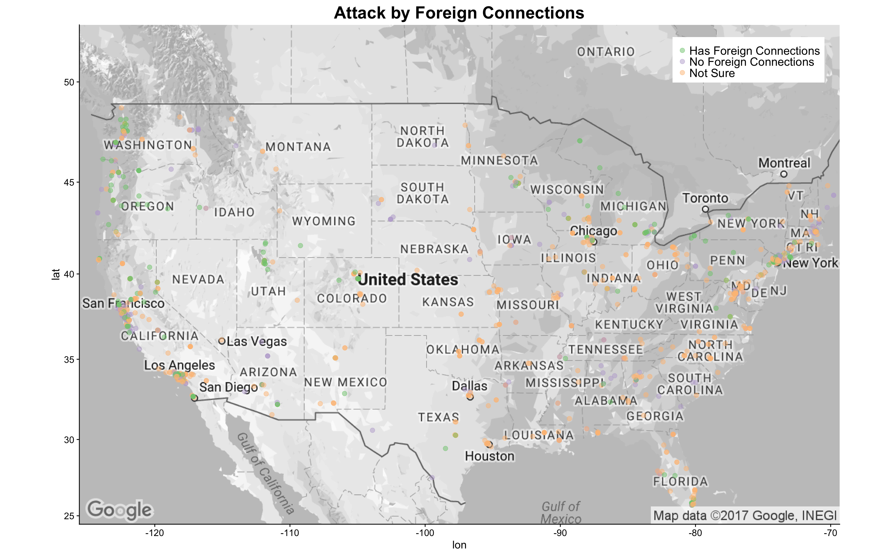
Although a large portion of the attacks does not have a certain connection with foreign entities, I did see some attacks that have clear foreign connections. Not surprisingly, these attacks are more dense near the coastal areas and the lake areas, where overseas connections are more accessible. It is also noted that several inland states also experienced attacks with foreign links.
Since it seems that attacks with foreign connections happened more often in coastal areas, I zoomed in on the U.S. East Coast and West Coast in greater details separately. First, I looked at East Coast where the attacks appear to be most dense: the Washington, D.C. to New York City area.
basemap_east <- get_googlemap(center = c(lon = -75, lat = 40),
                              zoom = 7,
                              size = c(640, 420),
                              maptype = 'roadmap',
                              color = 'bw') %>% ggmap()

g14_e <- basemap_east + geom_point(aes(x = longitude, y = latitude,
                                       color = INT_ANY),
                                   data = dt5,
                                   alpha = .7,
                                   size = 3) +
  ggtitle("Attack by Foreign Connections - East Coast") +
  scale_colour_manual(values = brewer.pal(3, "Accent")) +
  theme(legend.position = c(0.79, 0.1),
        legend.title = element_blank(),
        legend.text = element_text(size = 15),
        legend.background = element_rect(fill = 'white'),
        plot.title = element_text(size=22))
g14_e
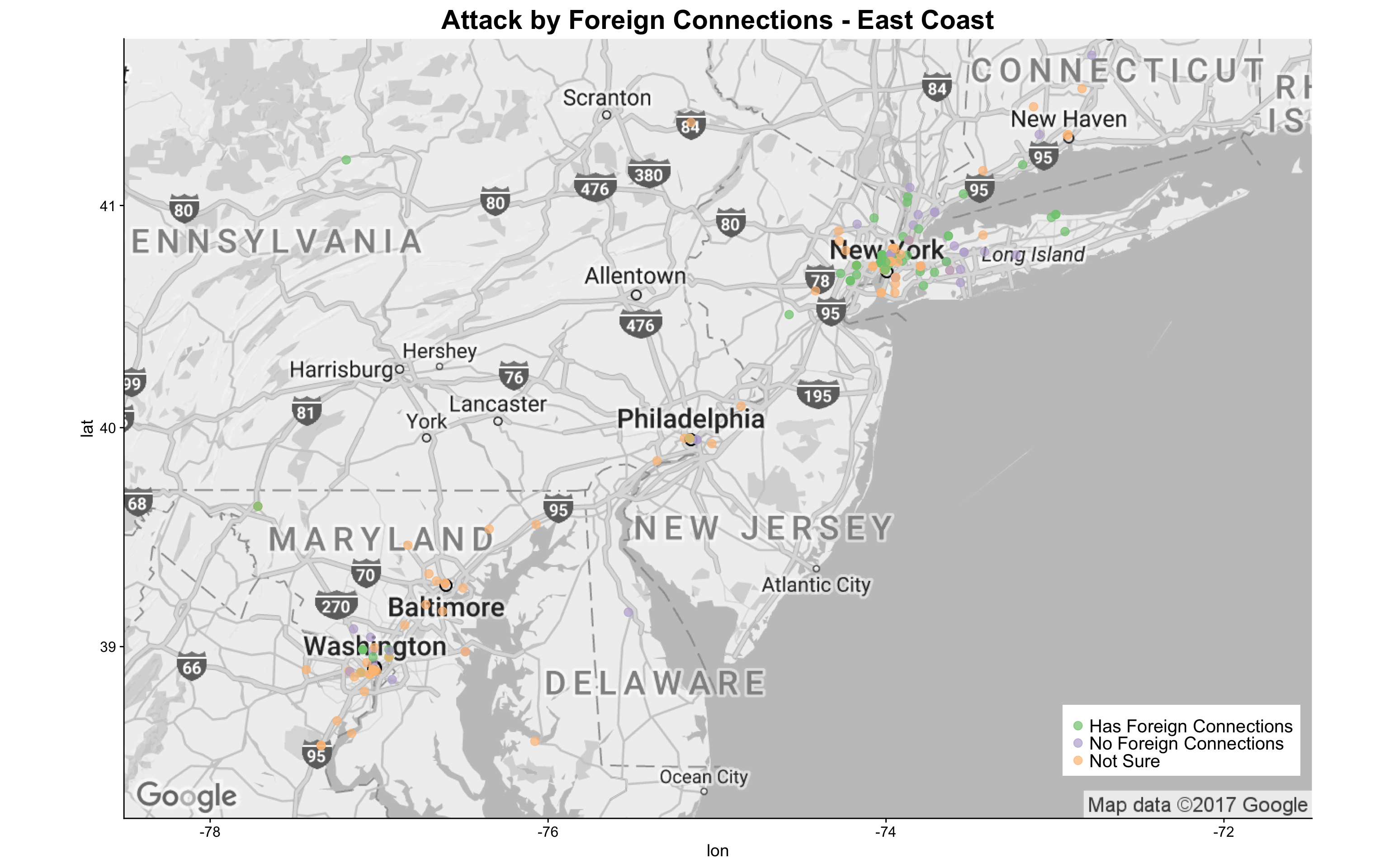
The above graph clearly indicates that the New York City metro area has more attacks than the Washington, D.C. metro area and Philadelphia. More importantly, there were more attacks with foreign connections in the NYC metro area. Interested in the locations of these attacks in NYC? I created a map below:
basemap_nyc <- get_googlemap(center = c(lon = -74, lat = 40.8),
                         zoom = 10,
                         size = c(640, 420),
                         maptype = 'roadmap',
                         color = 'bw') %>% ggmap()

g14_nyc <- basemap_nyc + geom_point(aes(x = longitude, y = latitude,
                                color = INT_ANY),
                                data = dt5,
                                alpha = .7,
                                size = 5) +
  ggtitle("Attack by Foreign Connections - NYC Metro") +
  scale_colour_manual(values = brewer.pal(3, "Accent")) +
  theme(legend.position = c(0.79, 0.1),
        legend.title = element_blank(),
        legend.text = element_text(size = 15),
        legend.background = element_rect(fill = 'white'),
        plot.title = element_text(size=22))
g14_nyc
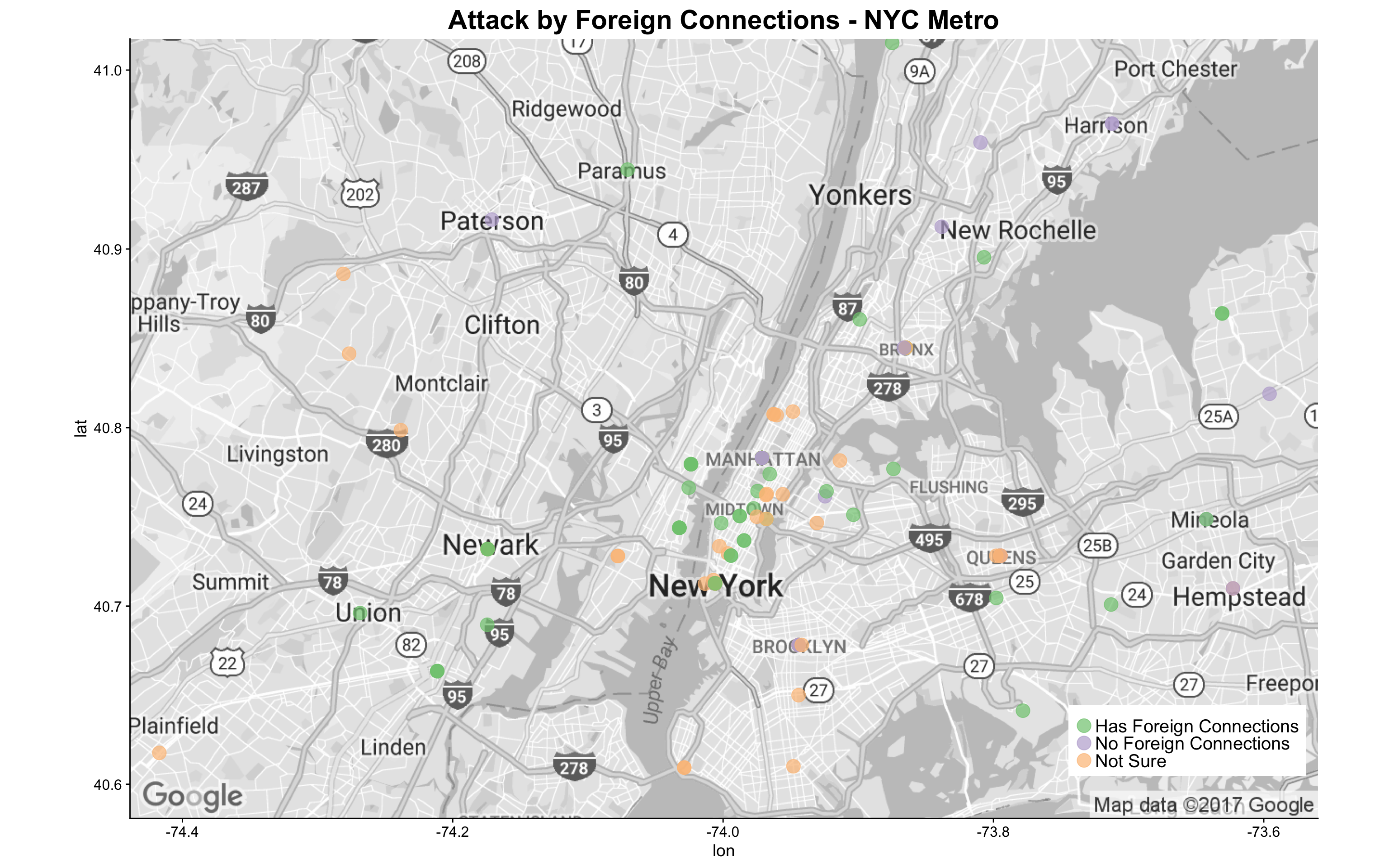
It appears that for attacks that the GTD provided confirmed information, almost all that happened in NYC metro area have foreign connections!
I then zoomed in on the U.S. West Coast to check out the attack locations:
basemap_west <- get_googlemap(center = c(lon = -120, lat = 40),
                         zoom = 5,
                         size = c(640, 420),
                         maptype = 'roadmap',
                         color = 'bw') %>% ggmap()

g14_w <- basemap_west + geom_point(aes(x = longitude, y = latitude,
                                color = INT_ANY),
                            data = dt5,
                            alpha = .5,
                            size = 2.5) +
  ggtitle("Attack by Foreign Connections - West Coast") +
  scale_colour_manual(values = brewer.pal(3, "Accent")) +
  theme(legend.position = c(0.01, 0.12),
        legend.title = element_blank(),
        legend.text = element_text(size = 15),
        legend.background = element_rect(fill = 'white'),
        plot.title = element_text(size=22))
g14_w
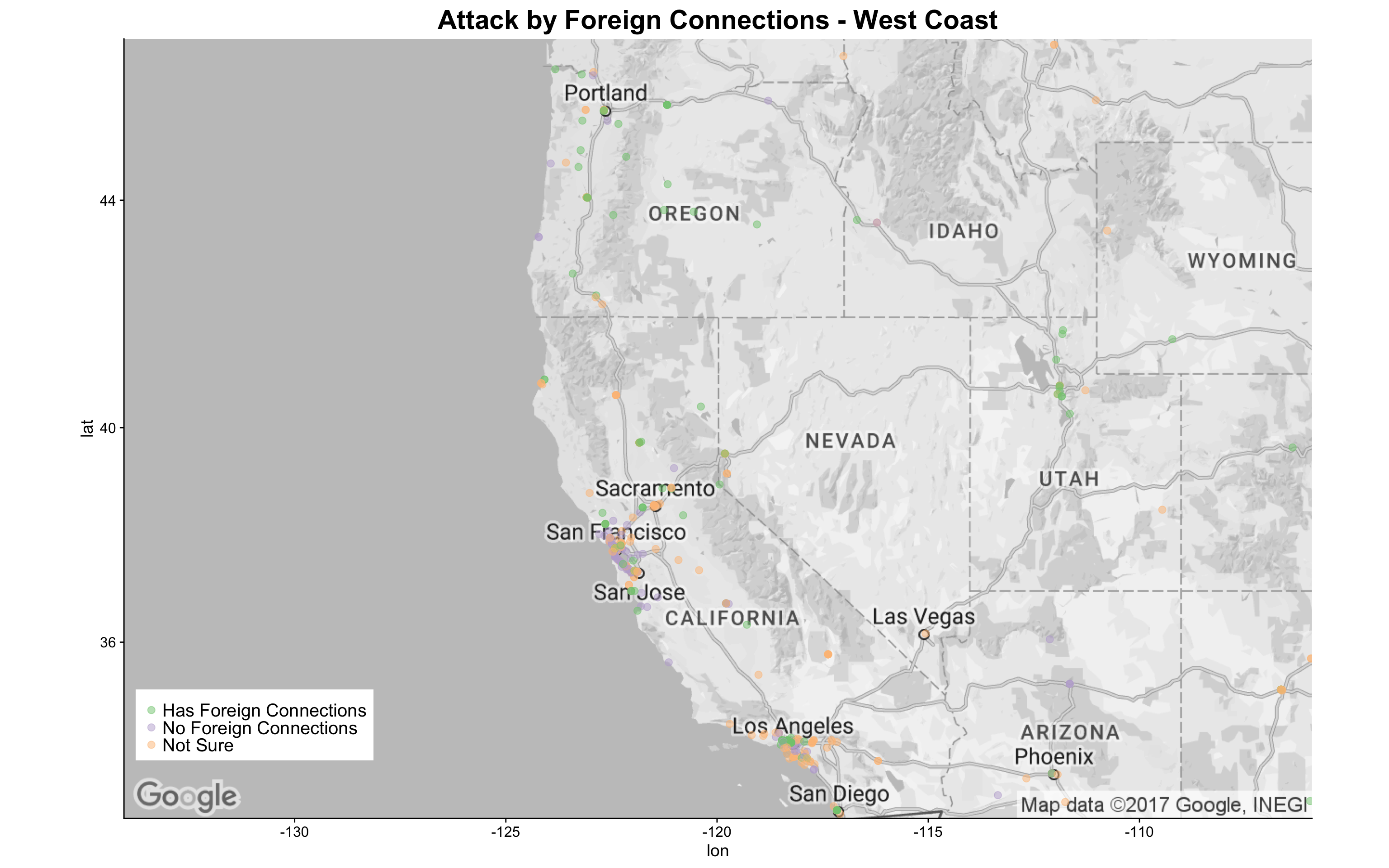
It appears that attacks in the West Coast cluster around Portland, Northern California, and Los Angeles metro area. The map indicates that attacks with foreign connections happened more often than those without. This finding again supports that attacks with foreign connections cluster around coastal areas.
Question 3: Did Attacks from Different Eras Happen in Different Locations?
Another aspect I would like to explore on the map is how are attacks spreading out across the U.S. in different eras. I broke down the iyear variable into three eras - 1970s-1980s,1990s, and Since 2000 - to roughly match the time before the Cold War ended, the 1990s, and the era after “9.11”.
g15 <- basemap + geom_point(aes(x = longitude, y = latitude,
                                color = idecades),
                            data = dt5,
                            alpha = .5,
                            size = 2.5) +
  ggtitle("Attack by Eras") +
  scale_colour_manual(values = rev(brewer.pal(5, "RdYlGn")[1:3])) +
  theme(legend.position = c(0.88, 0.94),
        legend.title = element_blank(),
        legend.text = element_text(size = 15),
        legend.background = element_rect(fill = 'white'),
        plot.title = element_text(size=22))
g15
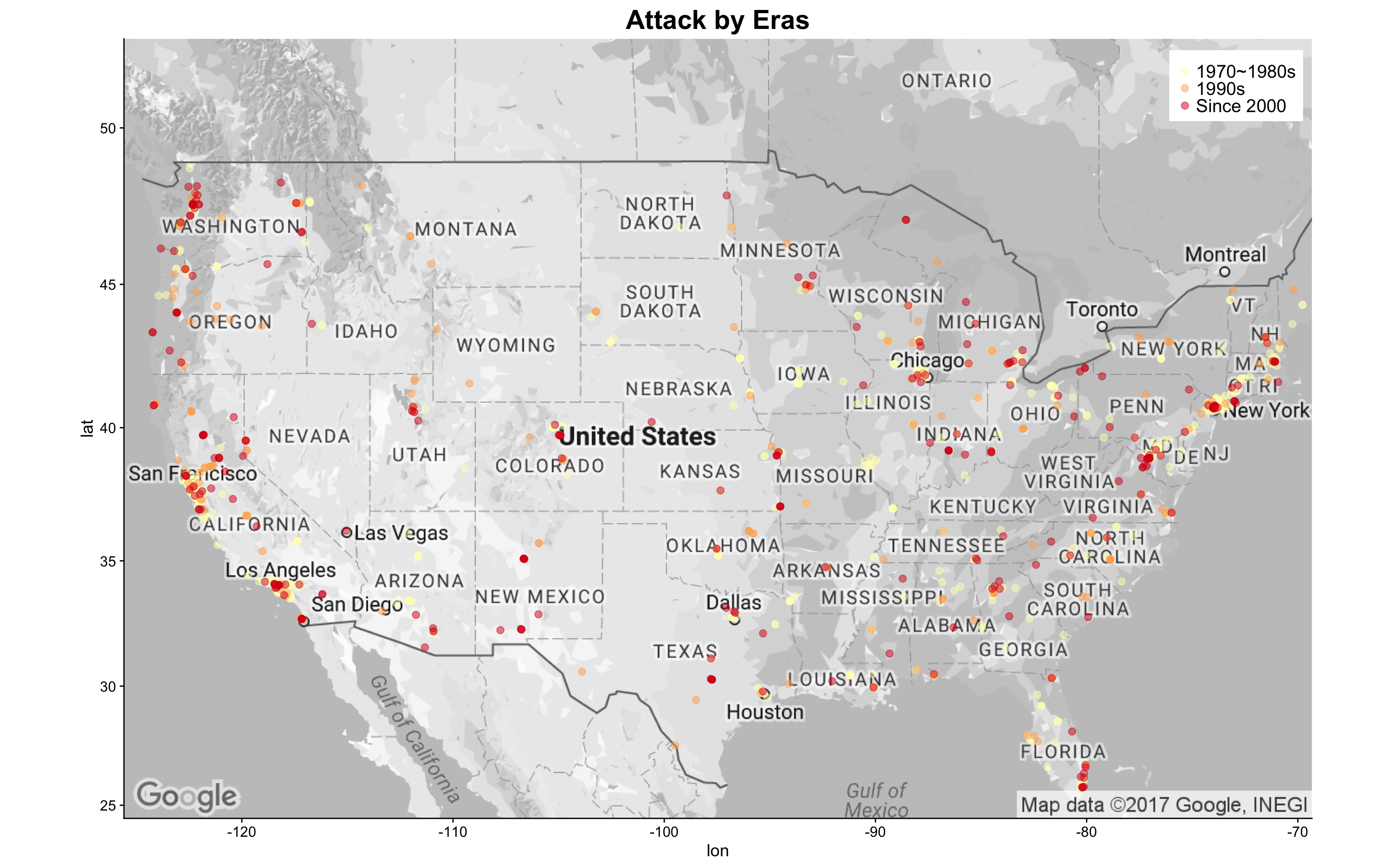
The above map indicates that later attacks in the 21 century distributes more densely in the coastal areas and the lake area, whereas attacks in the 1970s to 1980s are all over the place across the nation. I created the zoomed map for East Coast and West Coast as below:
g15_e <- basemap_east + geom_point(aes(x = longitude, y = latitude,
                                color = idecades),
                                data = dt5,
                                alpha = .5,
                                size = 3) +
  ggtitle("Attack by Eras - East Coast") +
  scale_colour_manual(values = rev(brewer.pal(5, "RdYlGn")[1:3])) +
  theme(legend.position = c(0.88, 0.1),
        legend.title = element_blank(),
        legend.text = element_text(size = 15),
        legend.background = element_rect(fill = 'white'),
        plot.title = element_text(size=22))
g15_e
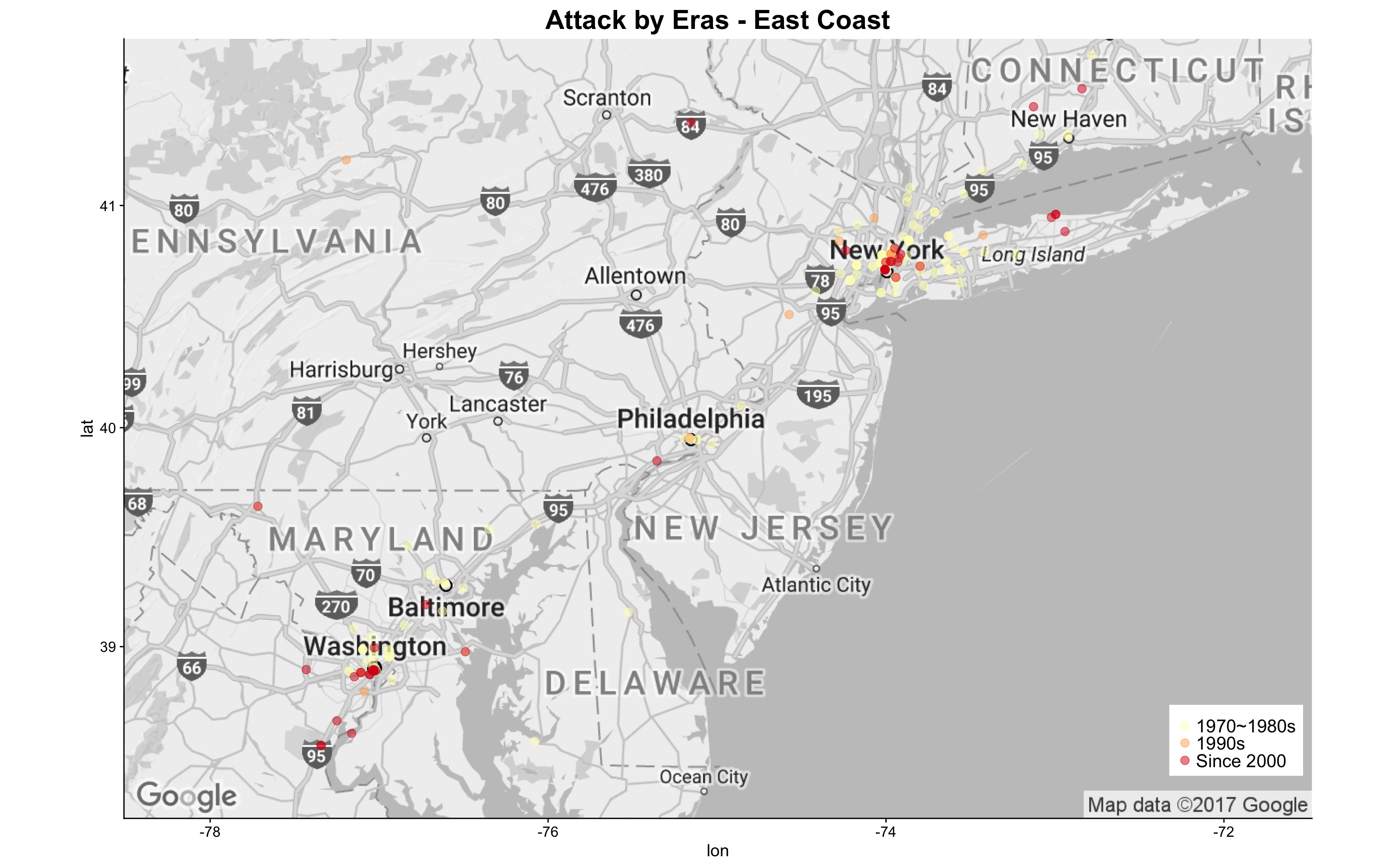
For attacks that happened in the East Coast, it appears that more recent attacks are more dense in the heart of the cities (this case is especially true for those happened in NYC metro area).
g15_w <- basemap_west + geom_point(aes(x = longitude, y = latitude,
                                       color = idecades),
                                   data = dt5,
                                   alpha = .5,
                                   size = 3) +
  ggtitle("Attack by Eras - West Coast") +
  scale_colour_manual(values = rev(brewer.pal(5, "RdYlGn")[1:3])) +
  theme(legend.position = c(0.01, 0.11),
        legend.title = element_blank(),
        legend.text = element_text(size = 15),
        legend.background = element_rect(fill = 'white'),
        plot.title = element_text(size=22))
g15_w
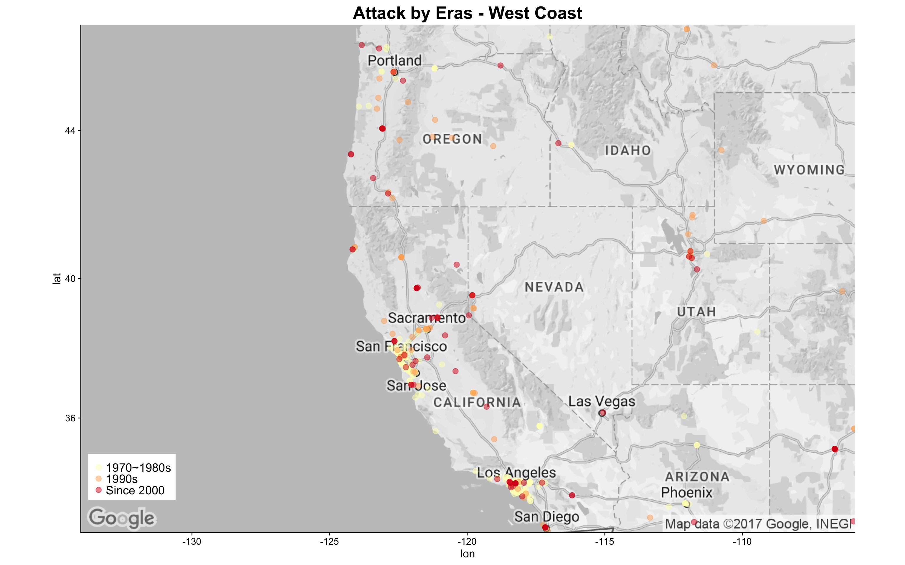
For attacks that happened in the West Coast, it seems that those of earlier decades are more dense in the southern areas.
Question 4: Did attacks of different characteristics happened in different locations?
Now that I have learnt much more of where the attacks are happening, I wanted to create a more detailed map to compare attacks of different types and targets. These maps will help me better comprehend previous findings in the context of geolocations. I created heatmaps and contour lines based on location density of attack counts and then cross-tabulated these maps with categorical variables.
The first thing I did is to generate a dataframe for this analysis:
# Create a attack data set with location, nkill, and nwound, will also keep sliceability with other factors
# Adjust factor level names for better display in faceted visuals
dt6 <- dt %>%
  dplyr::select(eventid, iyear, provstate, latitude, longitude, success, nkill, nwound, property, propextent,INT_ANY,
                targtype1_txt, targtype2_txt, targtype3_txt,
                attacktype1_txt, attacktype2_txt, attacktype3_txt) %>%
  melt(id.vars =c('eventid', 'iyear', 'provstate', 'latitude', 'longitude', 'success', 'nkill', 'nwound', 'property', 'propextent', 'INT_ANY', 'attacktype1_txt', 'attacktype2_txt','attacktype3_txt'),
       measure.vars = c('targtype1_txt','targtype2_txt', 'targtype3_txt'),
       na.rm = TRUE, value.name = "targtype_txt") %>%
  dplyr::select(-variable) %>%
  melt(id.vars = c('eventid', 'iyear', 'provstate', 'latitude', 'longitude', 'success', 'nkill', 'nwound', 'property', 'propextent','INT_ANY','targtype_txt'),
       measure.vars = c('attacktype1_txt', 'attacktype2_txt','attacktype3_txt'),
       na.rm = TRUE, value.name = "attacktype_txt") %>%
  dplyr::select(-variable) %>%
  mutate(targtype_txt = factor(
    ifelse(targtype_txt=="Business","Business",
           ifelse(targtype_txt=="Government (General)","Government (General)",
                  ifelse(targtype_txt=="Private Citizens & Property", "Private Citizens & Property","Other")))),
    attacktype_txt = factor(
      ifelse(attacktype_txt=="Bombing/Explosion", "Bombing/Explosion",
             ifelse(attacktype_txt=="Facility/Infrastructure Attack", "Facility/Infrastructure Attack",
                    ifelse(attacktype_txt=="Armed Assault", "Armed Assault", "Other")))),
    propextent = factor(as.character(ifelse(is.na(propextent), 'Unknown',
      ifelse(propextent == 1, 'Catastrophic (likely > $1 billion)',
             ifelse(propextent == 2, 'Major (likely > $1 million but < $1 billion)',
                    ifelse(propextent ==3, 'Minor (likely < $1 million)','Unknown')))))),
    property = factor(
      ifelse(is.na(property), 'Unknown',
             ifelse(property == 0, 'No Property Damage', 'Has Property Damage'))),
    nkill = ifelse(is.na(nkill), 0, nkill),
    nwound = ifelse(is.na(nwound), 0, nwound),
    n_killwound = nkill + nwound,
    INT_ANY = factor(ifelse(is.na(INT_ANY), "Not Sure",
                            ifelse(INT_ANY==0, "No Foreign Connections","Has Foreign Connections" ))),
    idecades = factor(ifelse(iyear >= 2000, "Since 2000",
                             ifelse(iyear >= 1990,  "1990s","1970~1980s"))),
    success = factor(ifelse(success == 1, 'Succeed', 'Failed'))
    )
Then I customized the base map canvas for this analysis:
# download basic map layers for plotting
base.map <- get_googlemap(center = c(lon = -97.5, lat = 40),
                         zoom = 4,
                         size = c(640, 420),
                         maptype = 'roadmap',
                         color = 'bw') %>% ggmap(base_layer = ggplot(aes(x = longitude, y = latitude), data = dt6))
I then explored the spatial distribution by revisiting some of the variables I used previously. First, I looked at the distribution of attacks based on target type.
g17 <- base.map + stat_density2d(aes(x=longitude, y=latitude, fill=..level.., alpha=..level..),
                                 bins=5, geom="polygon", data=dt6) +
  scale_fill_gradient(low="green1", high="red1") + scale_alpha(range = c(0.1, 0.7), guide = FALSE) +
  facet_wrap(~targtype_txt, nrow = 2) +
  guides(fill=guide_legend(title="Attack Density")) +
  ggtitle("Attack Density by Target Type") +
  theme(axis.title=element_blank(),
        axis.text=element_blank(),
        axis.ticks=element_blank(),
        legend.text = element_blank(),
        plot.title = element_text(color="black", size=22, hjust=0))
g17
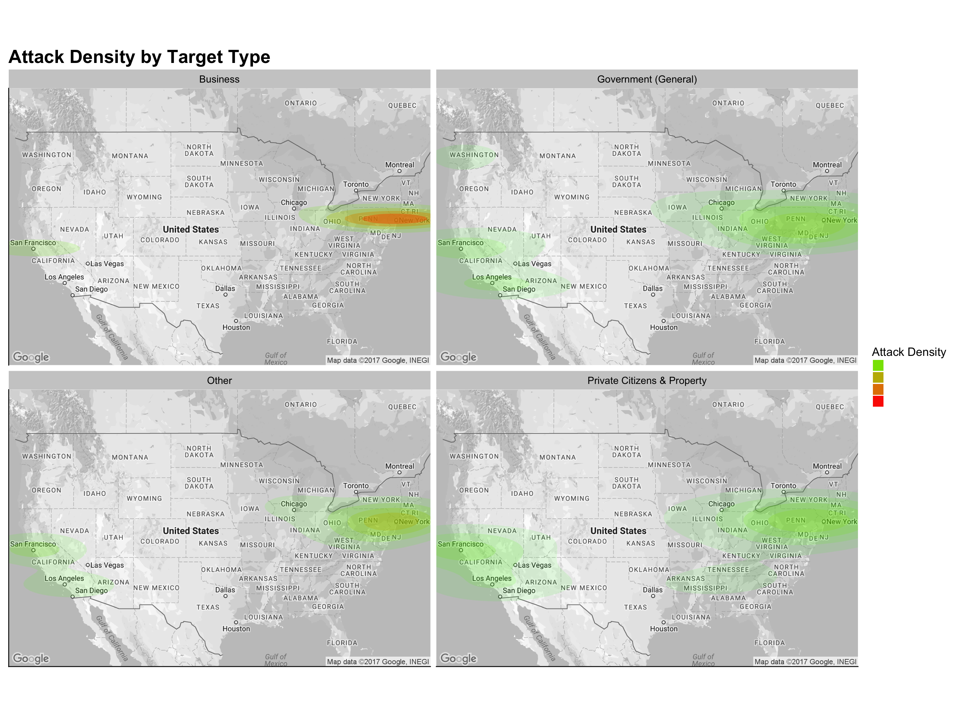
Be noted that the attacks on Business are most dense in the northeastern coastal area. Attacks on Government(general), Private Citizens & Property, and Other targets spread out more evenly. It is also worth noticing that the southern states such as Tennessee, Arkansas, and Mississippi only experienced attacks targeting Private Citizen & Property.
I then moved forward to explore the attack locations by attack types, as shown below:
# Create ride density maps
g18 <- base.map + stat_density2d(aes(x=longitude, y=latitude, fill=..level.., alpha=..level..),
                          bins=5, geom="polygon", data=dt6) +
  scale_fill_gradient(low="green1", high="red1") + scale_alpha(range = c(0.1, 0.7), guide = FALSE) +
  facet_wrap(~attacktype_txt, nrow = 2) +
  guides(fill=guide_legend(title="Attack Density")) +
  ggtitle("Attack Density by Attack Type") +
  theme(axis.title=element_blank(),
        axis.text=element_blank(),
        axis.ticks=element_blank(),
        legend.text = element_blank(),
        plot.title = element_text(color="black", size=22))
g18
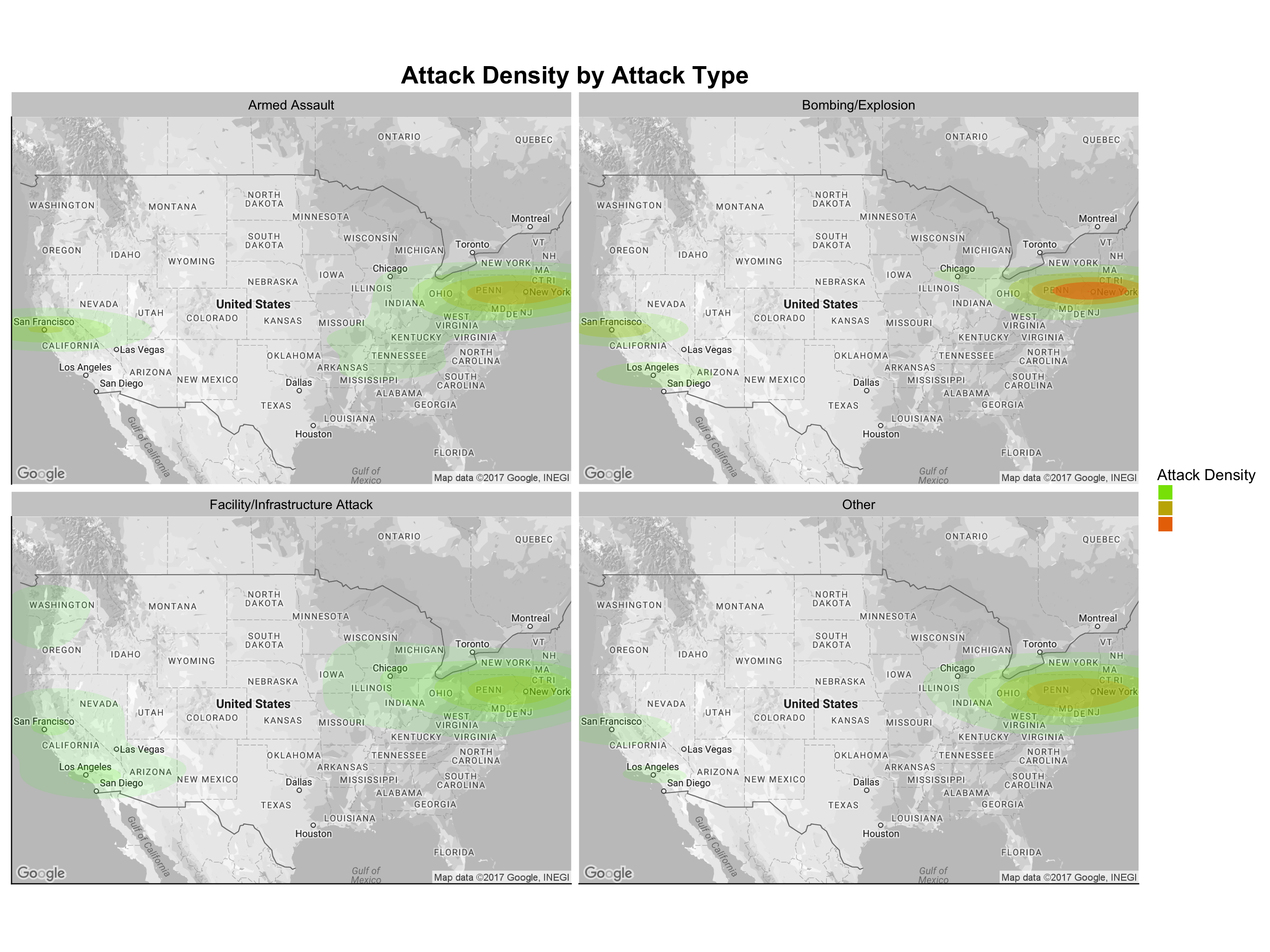
Although I did not observe much of a difference among the different attack types across the nation, Bombing/Explosion and Armed Assault appear to be more densely distributed in East Coast, while Facility/Infrastructure appears to be the spreading out more evenly.
Another variable I have not analyzed yet is propextent,i.e., the property loss level resulted from the incident.
# Create ride density maps
g19 <- base.map + stat_density2d(aes(x=longitude, y=latitude, fill=..level.., alpha=..level..),
                          bins=5, geom="polygon", data=dt6) +
  scale_fill_gradient(low="green1", high="red1") + scale_alpha(range = c(0.1, 0.6), guide = FALSE) +
  facet_wrap(~propextent, nrow = 2) +
  guides(fill=guide_legend(title="Attack Density")) +
  ggtitle("Attack Density by Property Loss") +
  theme(axis.title=element_blank(),
        axis.text=element_blank(),
        axis.ticks=element_blank(),
        legend.text = element_blank(),
        plot.title = element_text(color="black", size=22))
g19
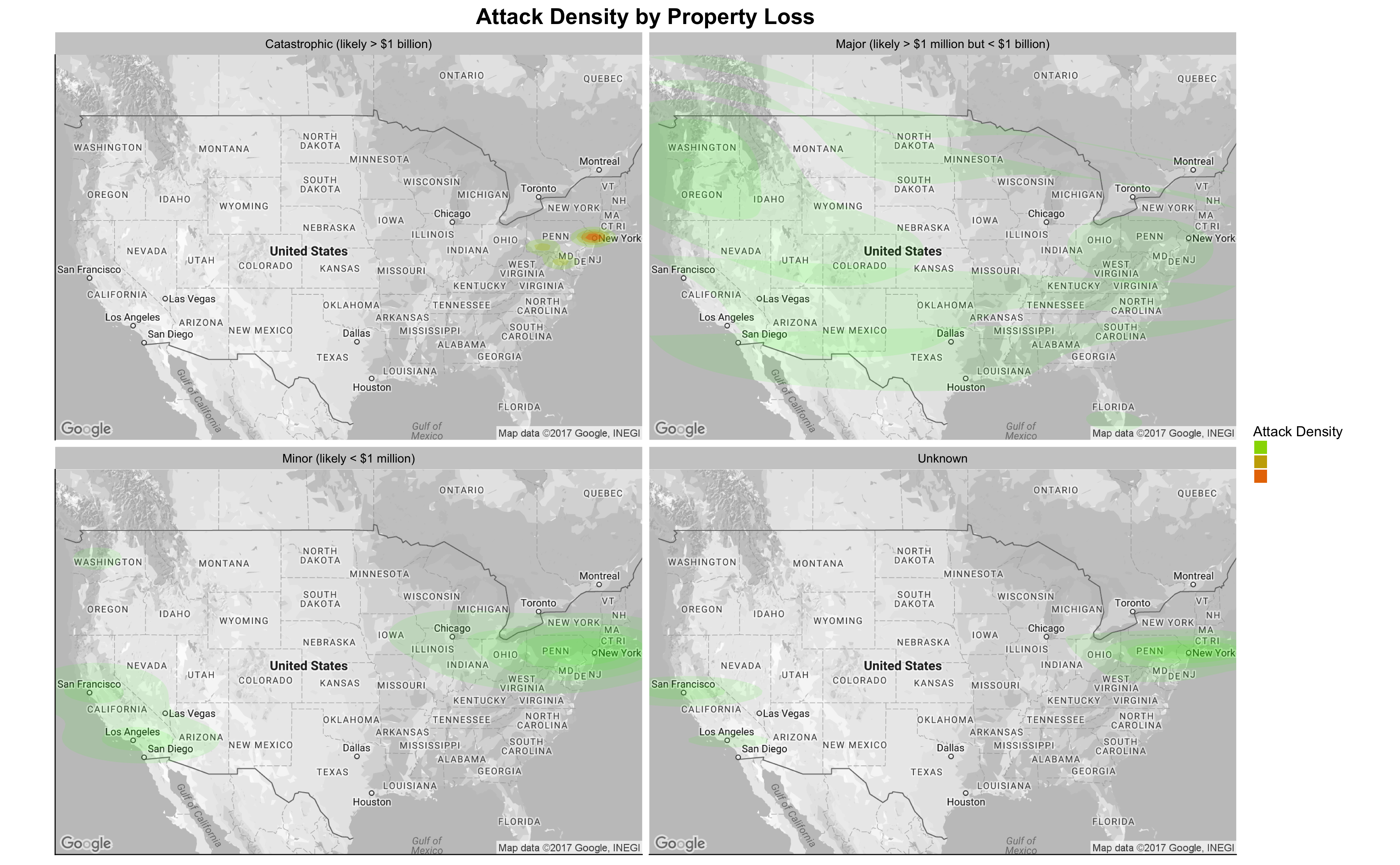
It is apparent that the Catastrophic property loss only happened during the “9.11” attack. What is counterintuitive is the fact that attacks resulted in a Major property loss with more than USD 1 million spreaded out evenly across the nation.
Question 5: What Are the Motives or the Group Affiliations of U.S. Terror Attacks?
In the last question, I tried to explain the “rationale” behind the terror attacks in the U.S. over the years. Due to the limitation of the dataset, I was not able to directly identify the connections between the perpetrators and the foreign terror groups (if any). However, the GTD does have gname (group claiming responsibility of the attack) and motive (text explanation of possible motivation of the attack) variables. I will use these two variables to understand the “motivations” behind the U.S. terror attacks.
I prepared my answer by analyzing the incident counts in the U.S. and the World for each terror group and visualizing the groups using scatterplots.
# Create a long table for group-related data in the U.S.
dt7 <- dt %>% mutate(nkill = ifelse(is.na(nkill), 0, nkill),
                     nwound = ifelse(is.na(nwound), 0, nwound),
                     n_killwound = nkill + nwound,
                     propextent = factor(as.character(ifelse(is.na(propextent), 'Unknown',
                                                             ifelse(propextent == 1,
                                                                    'Catastrophic (likely > $1 billion)',
                                                                    ifelse(propextent == 2,
                                                                           'Major (likely > $1 million but < $1 billion)', ifelse(propextent ==3, 'Minor (likely < $1 million)','Unknown'))))))) %>%
  dplyr::select(eventid, iyear, n_killwound,propextent,targtype1_txt, targtype2_txt, targtype3_txt, attacktype1_txt, attacktype2_txt, attacktype3_txt, gname, gname2, gname3, weaptype1_txt, weaptype2_txt, weaptype3_txt) %>%
  melt(id.vars =c('eventid','iyear', 'n_killwound','propextent','attacktype1_txt', 'attacktype2_txt', 'attacktype3_txt','gname', 'gname2', 'gname3', 'weaptype1_txt', 'weaptype2_txt', 'weaptype3_txt'),
       measure.vars = c('targtype1_txt','targtype2_txt', 'targtype3_txt'),
       na.rm = TRUE, value.name = "targtype_txt") %>%
  dplyr::select(-variable) %>%
  melt(id.vars = c('eventid','iyear', 'n_killwound','propextent','targtype_txt','gname', 'gname2',
                   'gname3', 'weaptype1_txt', 'weaptype2_txt','weaptype3_txt'),
       measure.vars = c('attacktype1_txt', 'attacktype2_txt','attacktype3_txt'),
       na.rm = TRUE, value.name = "attacktype_txt") %>%
  dplyr::select(-variable) %>%
  melt(id.vars = c('eventid','iyear','n_killwound','propextent','targtype_txt','attacktype_txt',
                   'weaptype1_txt','weaptype2_txt', 'weaptype3_txt'),
       measure.vars = c('gname', 'gname2', 'gname3'),
       na.rm = TRUE, value.name = "gname") %>%
  dplyr::select(-variable) %>%
  melt(id.vars = c('eventid','iyear','n_killwound','propextent','targtype_txt', 'attacktype_txt','gname'),
       measure.vars = c('weaptype1_txt','weaptype2_txt', 'weaptype3_txt'),
       na.rm = TRUE, value.name = "weaptype_txt") %>%
  dplyr::select(-variable) %>% mutate(targtype_txt = factor(targtype_txt),
                                      attacktype_txt = factor(attacktype_txt),
                                      idecades = factor(ifelse(iyear >= 2010, "Since 2010",
                                             ifelse(iyear >= 2000,  "2000s",
                                                    ifelse(iyear >= 1990, "1990s",
                                                           ifelse(iyear >= 1980, "1980s", "1970s"))))))
# Create a similar table for the world, as a reference data in following analysis
dt7_w <- dt_w %>% mutate(nkill = ifelse(is.na(nkill), 0, nkill),
                     nwound = ifelse(is.na(nwound), 0, nwound),
                     n_killwound = nkill + nwound,
                     propextent = factor(as.character(ifelse(is.na(propextent), 'Unknown',
                                                             ifelse(propextent == 1,
                                                                    'Catastrophic (likely > $1 billion)',
                                                                    ifelse(propextent == 2,
                                                                           'Major (likely > $1 million but < $1 billion)', ifelse(propextent ==3, 'Minor (likely < $1 million)','Unknown'))))))) %>%
  dplyr::select(eventid, iyear, n_killwound,propextent,targtype1_txt, targtype2_txt, targtype3_txt, attacktype1_txt, attacktype2_txt, attacktype3_txt, gname, gname2, gname3, weaptype1_txt, weaptype2_txt, weaptype3_txt) %>%
  melt(id.vars =c('eventid','iyear', 'n_killwound','propextent','attacktype1_txt', 'attacktype2_txt', 'attacktype3_txt','gname', 'gname2', 'gname3', 'weaptype1_txt', 'weaptype2_txt', 'weaptype3_txt'),
       measure.vars = c('targtype1_txt','targtype2_txt', 'targtype3_txt'),
       na.rm = TRUE, value.name = "targtype_txt") %>%
  dplyr::select(-variable) %>%
  melt(id.vars = c('eventid','iyear', 'n_killwound','propextent','targtype_txt','gname', 'gname2',
                   'gname3', 'weaptype1_txt', 'weaptype2_txt','weaptype3_txt'),
       measure.vars = c('attacktype1_txt', 'attacktype2_txt','attacktype3_txt'),
       na.rm = TRUE, value.name = "attacktype_txt") %>%
  dplyr::select(-variable) %>%
  melt(id.vars = c('eventid','iyear','n_killwound','propextent','targtype_txt','attacktype_txt',
                   'weaptype1_txt','weaptype2_txt', 'weaptype3_txt'),
       measure.vars = c('gname', 'gname2', 'gname3'),
       na.rm = TRUE, value.name = "gname") %>%
  dplyr::select(-variable) %>%
  melt(id.vars = c('eventid','iyear','n_killwound','propextent','targtype_txt', 'attacktype_txt','gname'),
       measure.vars = c('weaptype1_txt','weaptype2_txt', 'weaptype3_txt'),
       na.rm = TRUE, value.name = "weaptype_txt") %>%
  dplyr::select(-variable) %>% mutate(targtype_txt = factor(targtype_txt),
                                      attacktype_txt = factor(attacktype_txt),
                                      idecades = factor(ifelse(iyear >= 2010, "Since 2010",
                                             ifelse(iyear >= 2000,  "2000s",
                                                    ifelse(iyear >= 1990, "1990s",
                                                           ifelse(iyear >= 1980, "1980s", "1970s"))))))
# Define function Mode() for easier summarization
Mode <- function(x) {
  ux <- unique(x)
  ux[which.max(tabulate(match(x, ux)))][1]
}

dt7.1_w <- dt7_w %>% group_by(gname) %>% summarise(world_incident = n_distinct(eventid))
dt7.1_c <- dt %>% group_by(gname) %>% mutate(nkill = ifelse(is.na(nkill), 0, nkill),
                                             nwound = ifelse(is.na(nwound), 0, nwound),
                                             n_killwound = nkill + nwound) %>%
  summarise(n_casualty = sum(n_killwound))
dt7.1 <- dt7 %>% group_by(gname) %>% summarise(us_incident = n_distinct(eventid),
                                               property_loss = Mode(propextent)) %>%
  left_join(dt7.1_w, by = c(gname = "gname")) %>% left_join(dt7.1_c, by = c(gname = "gname"))

g20 <- dt7.1 %>% ggplot(aes(x=log(us_incident), y=log(world_incident))) +
  geom_point(aes(size = n_casualty, color = property_loss)) +geom_smooth(method=lm) +
  labs(title="Terror Group Attacks in the World vs in the U.S.",
       x = "Group's Attacks in the U.S. (log)",
       y = "Group's Attacks in the World (log)") +
  scale_color_discrete(name = "Property Loss") +
  scale_size_continuous(name = "Casualty Levels", range = c(2.5, 10)) +
  theme(legend.position = c(0.72, 0.2),
        legend.title = element_text(size = 20),
        legend.text = element_text(size = 15),
        legend.background = element_rect(fill = 'white'),
        plot.title = element_text(size=22))

g20
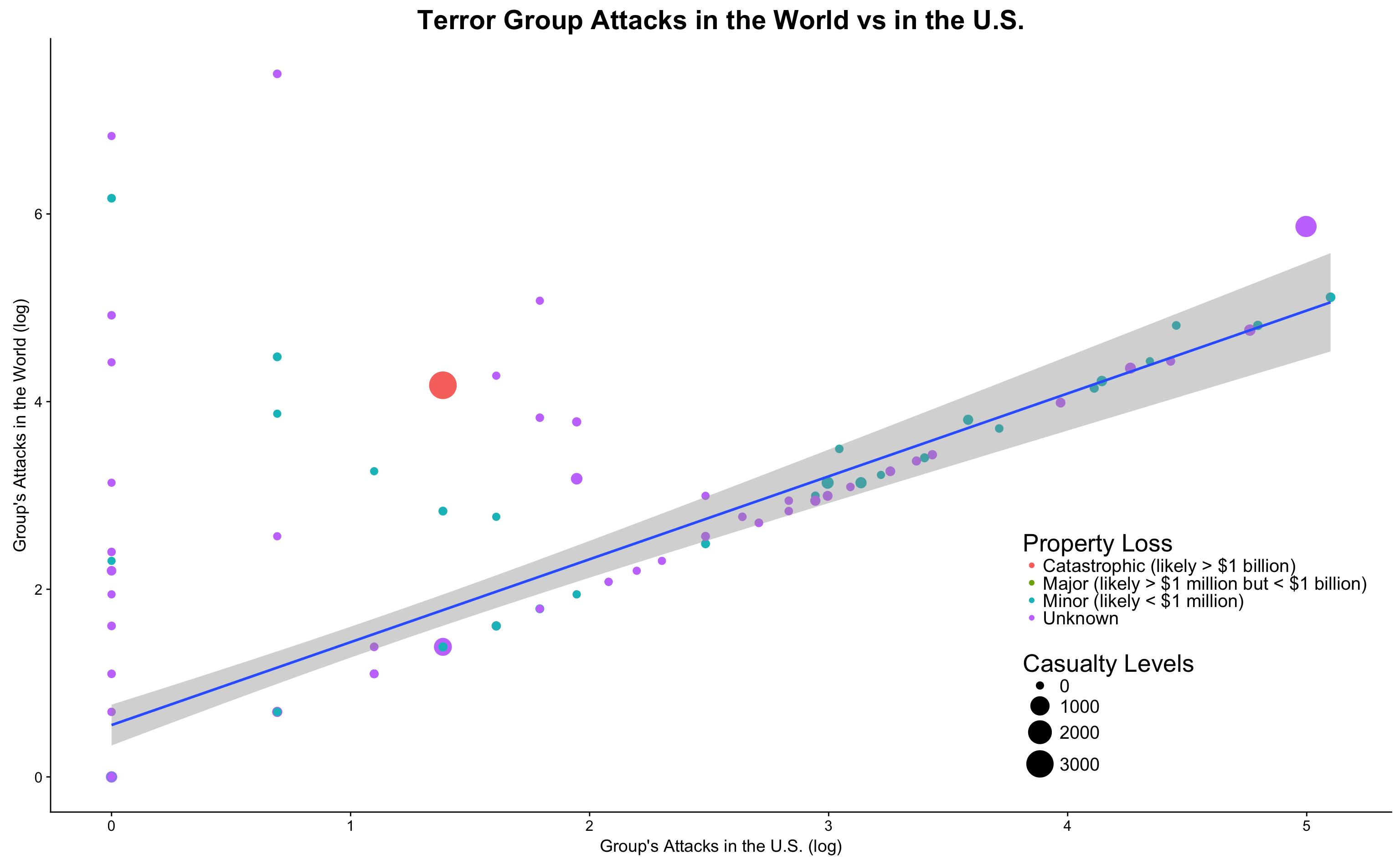
The above chart indicates that terror groups tend to have two different trends when we compare their attacks in the U.S. with those in the World: some don’t have much presence in the U.S. (groups on the left hand side of the graph going along the y axis) and some have major presence in the U.S. (groups shown along the regression line). For the groups that have presence in the U.S., we can observe a clear trend between their attacks in the U.S. and their attacks around the world. The “9.11” attack, which is the large red circle on the chart, appears to be an outlier (or “Black Swan” in international affairs terms) that goes against the general trend in the graph.
I stepped further to dive deeper into the groups that are mostly active (in terms of attack count) in the U.S.: How are these groups’ activities around the World?
# Function to display percentage
percent <- function(x, digits = 2, format = "f", ...) {
  paste0(formatC(100 * x, format = format, digits = digits, ...), "%")
}

# Identify the top 20 active groups in the U.S. attacks
dt7.2 <- (dt7.1 %>% arrange(desc(us_incident)) %>%
   mutate(
     us_portion = us_incident / world_incident,
     us_percentage = percent(us_incident / world_incident)))[1:20,]

g21 <- dt7.2 %>% ggplot(aes(x=us_incident, y=world_incident)) +
  geom_point(aes(size = us_portion, color = property_loss))+
  geom_smooth(method=lm) + scale_size_continuous(name = "Attacks in U.S. / Attacks in World", range = c(0.5, 5)) +
  geom_text_repel(aes(label=ifelse(us_incident>50, as.character(gname), '')), size = 5) +
  labs(title="20 Most Active Terror Group's Attacks in the U.S. vs in the World",
       x = "Group's Attacks in the U.S.",
       y = "Group's Attacks in the World") +
  scale_color_discrete(name = "Property Loss") +
  theme(legend.position = c(0.05, 0.8),
        legend.title = element_text(size = 15),
        legend.text = element_text(size = 10),
        legend.background = element_rect(fill = 'white'),
        plot.title = element_text(size=22))

g21
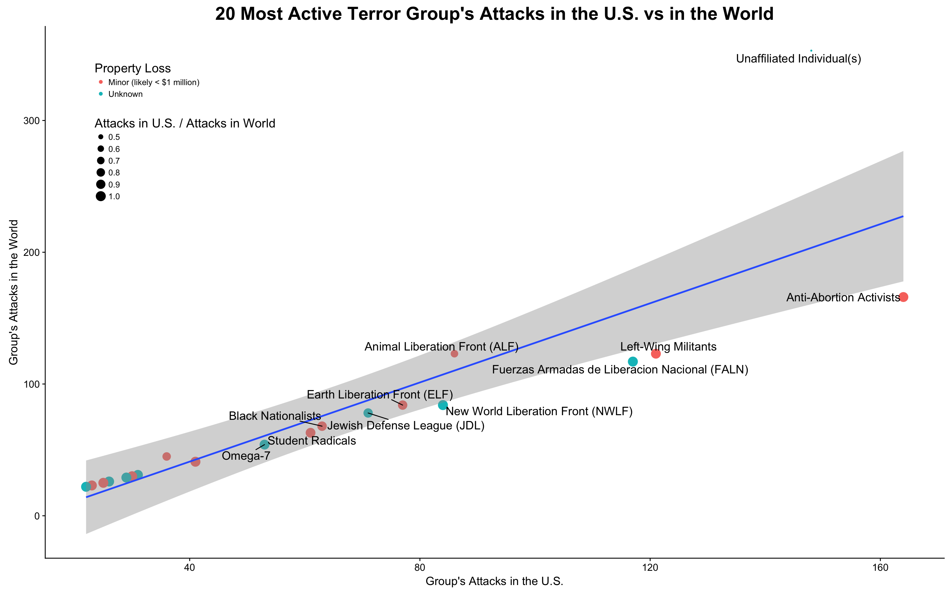
Interestingly enough, almost all of the most active terror groups (with the most attack counts) in the U.S. has conducted minor amount of attacks outside of the U.S. (with their U.S. attack / World attack close to 1). These most likely domestic terror groups did most of the property damage in the lower Minor levels, although the “Minor” here is nothing minor in our common sense; they are just scales to separate these attacks from the most deadly and catastrophic ones.
How about terror groups with the most attack count in the world? How many U.S. attacks are directly related to them? I created the following chart:
# Identify the top 20 groups with attacks in the world that also attacks the U.S.
dt7.3 <- (dt7.1 %>% arrange(desc(world_incident)) %>%
   mutate(
     us_portion = us_incident / world_incident,
     us_percentage = percent(us_incident / world_incident)))[1:20,]


g22 <- dt7.3 %>% ggplot(aes(x=log(us_incident), y=log(world_incident))) +
  geom_point(aes(size = us_portion, color = property_loss)) +
  scale_size_continuous(range = c(0.5,5), name = "Attacks in U.S. / Attacks in World") +
  geom_smooth(method=lm) +
  geom_text_repel(aes(label=ifelse(us_incident>100, as.character(gname),'')), size = 5) +
  labs(title="20 Most Active Terror Group's Attacks in the World vs in the U.S.",
       x = "Group's Attacks in the U.S. (log)",
       y = "Group's Attacks in the World (log)") +
  scale_color_discrete(name = "Property Loss") +
  theme(legend.position = c(0.05, 0.8),
        legend.title = element_text(size = 15),
        legend.text = element_text(size = 10),
        legend.background = element_rect(fill = 'white'),
        plot.title = element_text(size=22))

g22
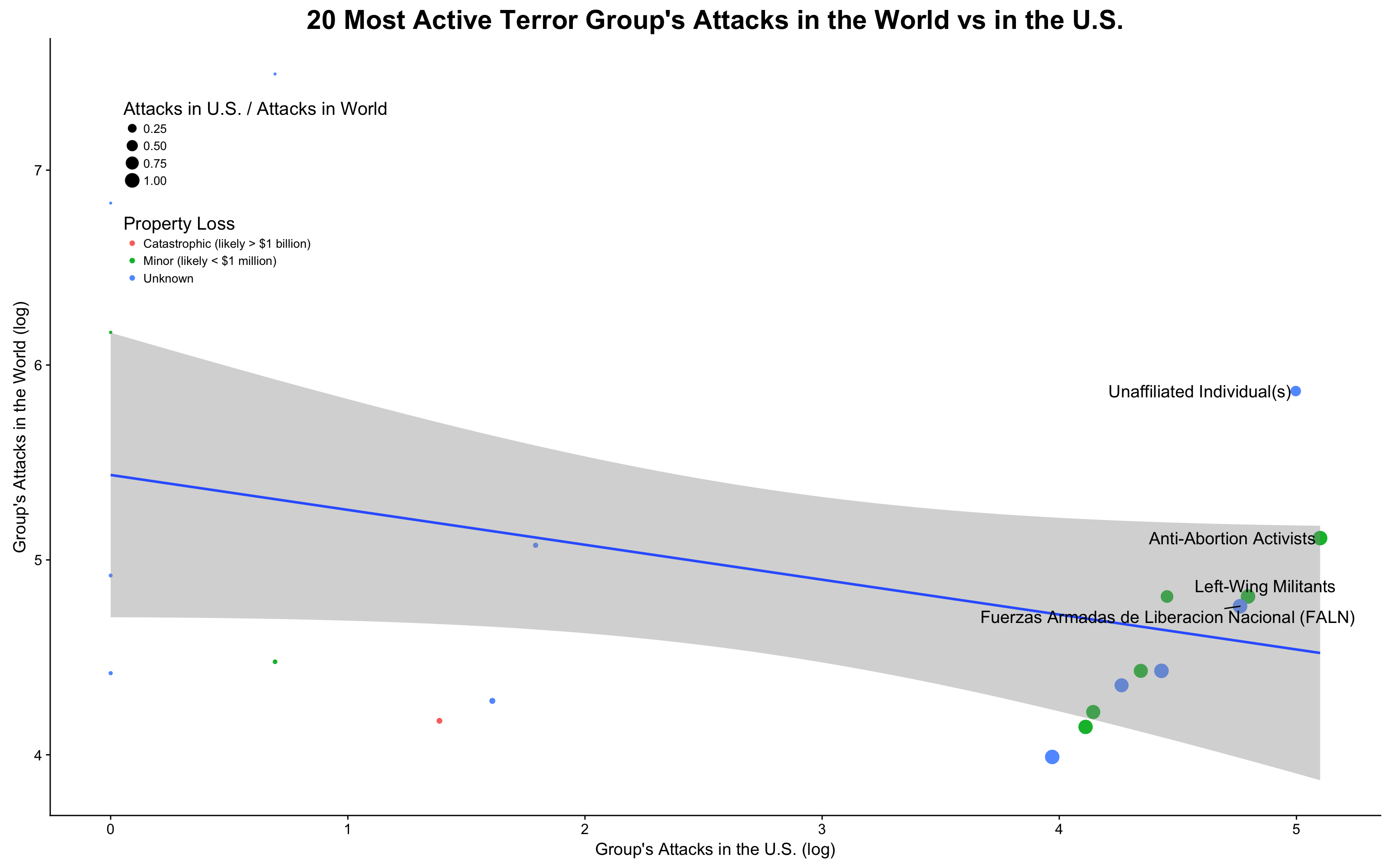
The most active worldwide terror groups, however, do not seem to have too much of a presence in the U.S. What I observed here is that some of the groups on the right are clustered with a positive relation between U.S. attacks and World attacks, while other groups on the left does not have much presense in the U.S. The color (i.e. property loss) of those clustered on the right are among the Unknown and Minor levels, which is consistent with my previous chart.
Findings and Conclusions
My in-depth analytics of the GTD database provide me with a brand-new understanding of the U.S. terror attacks history, much of which is counterintuitive:
- The certain and successful terror attacks in the U.S. are decreasing; attack number in recent years are far less than that of the 1970s
- The casualty of terror attacks in the U.S. dwarves in front of attacks around the world; however, “9.11” attacks are outliers and have the biggest life loss in the world terror attack history
- On the contrary, terror attacks and resulted casualties increased exponentially in other parts of the world since 2000, with Middle East, South Asia, and Sub-Saharan Africa suffering the most
- Attacks in the U.S. tend to happen more frequently on Mondays and Fridays, and often takes the form of Bombing/Explosion, Facility/Infrastructure Attack, or Armed Assault
- Business and Government (General) tends of be targets of the attacks before 1990s. In recent years, however, Religious Figures/Institutions, Police, and Abortion Related targets seem to receive more hits
- Around 682 attacks out of the 2164 had certain foreign connections; these attacks tend to happen in populous area and coastal areas
- Property loss of more than USD 1 million is usual among attacks, but only the “9.11” attacks claimed more than USD 1 billion in property loss
- The most active terror groups in the U.S. do majority of their attacks around the world in the U.S., indicating that they might be of domestic origin (although might have been inspired or helped by foreign entities). “9.11” attack, however, is conducted by a less active group in the U.S. in terms of attack count, but claims the most significant loss in life and property. It is the biggest outlier / “Black Swan” in the world terror attack history
Disclaimer
It is worth noting that the GTD data was collected through openly available sources; the precision of these findings fully depends on the quality of the sources. Additionally, since the database was maintained over a long period of time by multiple institutions, data consistency could be a challenge. Last but not least, the reported attacks in this dataset might not be enough to objectively reflect the terrorism threats to the U.S., since the information about attempted but failed attacks are not sufficiently reported.


Leave a Comment