
Quick Guide to Create Frequency Table from Wide Table Using R
library(dplyr)
library(reshape2)
library(ggplot2)
This post presents a way to display the distribution of multiple variables (with the same comparable unit) side by side and compare their distributions. Normally the data will come in a wide table form in the dataframe, making it impossible to directly use group labels to compare the distributions.
Let’s start by creating an example dataframe:
# generate a dataframe with 10 observations and 4 variables
user_id <- seq(1, 10)
var1_time <- runif(10, 1, 10)
var2_time <- sample(seq(30, 50), 10)
var3_time <- rnorm(10, 70, 9)
df <- data.frame(user_id, var1_time, var2_time, var3_time)
glimpse(df)
## Observations: 10
## Variables: 4
## $ user_id   <int> 1, 2, 3, 4, 5, 6, 7, 8, 9, 10
## $ var1_time <dbl> 2.054537, 8.347375, 7.089574, 3.198027, 1.708012, 7....
## $ var2_time <int> 38, 41, 33, 34, 32, 43, 30, 45, 47, 42
## $ var3_time <dbl> 88.80084, 68.84027, 70.66759, 75.27730, 77.33516, 73...
This is what we’ll usually have in our dataframes. The variables are represented horizontally as columns. However, for data visualization purposes, we will align the values of var1_time, var2_time, and var3_time as if they are one variable with different group levels; only in this way can we generate a side by side distribution comparison. Here, we need to turn this df into a long table format. In this long format, we will change the dataframe so that it only contains three variables: user_id, var_label, time_in_seconds. The R package reshape2 is ideal for this task, as shown below:
melt(df,
     # ID variables, variables not to split
     id.vars = c('user_id'),
     # Source columns to split
     measure.vars = c('var1_time','var2_time','var3_time'),
     # Name of the group label variable
     variable.name = 'var_name',
     # Name of the integrated value
     value.name = 'time_in_seconds') -> df_long
glimpse(df_long)
## Observations: 30
## Variables: 3
## $ user_id         <int> 1, 2, 3, 4, 5, 6, 7, 8, 9, 10, 1, 2, 3, 4, 5, ...
## $ var_name        <fctr> var1_time, var1_time, var1_time, var1_time, v...
## $ time_in_seconds <dbl> 2.054537, 8.347375, 7.089574, 3.198027, 1.7080...
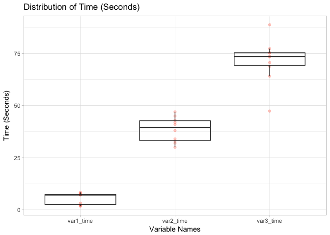
We can see that df_long follows what we desires: it kept the variables we don’t want to split (i.e. user_id) but “melted” other variables into one unified measure (i.e. time_in_seconds) with “group labels” (i.e. var_name). Now We can create a visual to compare the distributions of these three variables side by side, as shown below:
g1 <- ggplot(df_long) +
    geom_point(aes(x=var_name, y=time_in_seconds), alpha=0.3, color="tomato") +
    geom_boxplot(aes(x=var_name, y=time_in_seconds), alpha=0) +
    ggtitle("Distribution of Time (Seconds)") + xlab("Variable Names") +
    ylab("Time (Seconds)") + theme_light()
g1


Leave a Comment